


Kona Cotton Color Match: From Screen to Swatch
A Kona Cotton color match starts with a useful question: do you need the same fabric, the closest-looking replacement, or a solid that coordinates with a print? Those are three different jobs. A digital shortlist can help with the second and third; the first requires a reliable fabric identity.
Use screen colors to narrow the search, then compare actual cloth before committing to a large background or a run of adjacent patches. This process works across Kona Cotton, Moda Bella Solids and Art Gallery Fabrics Pure Solids without pretending that a shared color name or hex value guarantees interchangeable fabric.
Decide what "match" means for this quilt
Write the job beside the color you are looking for:
- Replace an existing solid: recover the manufacturer, collection, color name and product code. Compare a sample of the replacement with your existing fabric. A similar-looking screen swatch is insufficient when the two pieces will meet at a seam.
- Coordinate with a focus print: identify which part of the print matters. A pale ground and a small golden flower may suggest very different solids. Choose the area deliberately rather than sampling a random pixel.
- Reproduce a digital palette: treat the screen color as a direction. Your final fabric may differ numerically while preserving the light, dark and accent roles you wanted.
For exact identification, start with the manufacturer's own collection information. Robert Kaufman's Kona Cotton catalog provides named fabrics and product codes. It also cautions that monitor colors cannot be guaranteed to match actual fabric. Save the code with the name; "navy" by itself is too ambiguous for a repeat purchase.
If your real question is which fabric should occupy the background, first work through background fabric choice. This article begins after you have a color direction and need candidates you can identify and check.
Use physical cards as the final comparison surface
A card made with actual fabric swatches gives you a different kind of evidence from a printed chart or a webpage. Confirm what the particular card contains before buying it, and check that its edition includes the candidates you need.
In Moda's FAQ: Bella Solids, Oda May describes the color card's named fabric swatches. The same post credits Sherri McConnell's habit of tagging solid pieces with their color name and number. The post dates from 2015, so its useful lesson is identification and physical comparison; it is not proof that every accessory mentioned remains available today.
Art Gallery Fabrics' Pure Solids catalog lists a color card alongside the fabrics. Look up the current card and the specific fabric code rather than relying on an old screenshot of a chart. A color card also does not establish a retailer's stock or the quantity available for your project.
For a fabric you already own, take a clean scrap to compare with the card or a sample. For a focus print, carry a piece large enough to show both its ground and its motifs. Avoid judging only a narrow folded edge when the chosen solid will fill half the quilt.
Build a digital shortlist before shopping
For a Kona-specific search, Stash Fabrics' Solid Finder describes three inputs: a color wheel, a photo or a hex value, followed by nearby Kona solids. That makes it a useful place to collect names for a physical comparison. We reviewed the tool's published instructions; we did not verify a physical match or purchase fabric through it.
Use a hex value when you already have a digital palette. When working from a photo, remember that the file includes the effects of lighting, exposure and the camera. Sampling a shadowed fold will produce a different target from sampling the same cloth in an evenly lit area.
Keep three to five plausible candidates rather than declaring the first suggestion correct. Include one candidate on either side of your target's apparent warmth or darkness. That gives you a useful comparison at the card instead of a single name that encourages you to overlook a mismatch.
Find candidates for a QuiltLab fabric group
QuiltLab can search for candidates from an existing fabric group in a Standard quilt. The Quilt Editor guide explains the measured layout and fabric controls; the following labels were checked in the running product on October 10, 2026.
- Open Properties, then Quilt fabrics.
- At the group you want to investigate, choose Change fabric, then Match by color.
- Review Color matching method and Search fabrics in.
- Choose Fabric collections and select Find matches.
- Inspect the candidate names and previews before deciding whether to apply anything.
The production System Library included named Kona Cotton, Bella Solids and Pure Solids collections when checked. This does not establish catalog completeness or current shop stock.
The group search is broader than a solid-only search. For an original Cream group with screen value #F5EEDC, it returned real catalog candidates that included prints. A strong color match can therefore be a fabric whose overall appearance resembles the target, rather than a plain solid. Inspect the preview and collection identity; do not interpret the ranking as a brand filter, a solid filter or a certified cloth measurement.
You can inspect results and close the dialog without replacing the fabric. Keep the existing assignment while making a shortlist, especially when a project uses several similar light groups with different purposes.
Worked example: one cream target, three catalog candidates
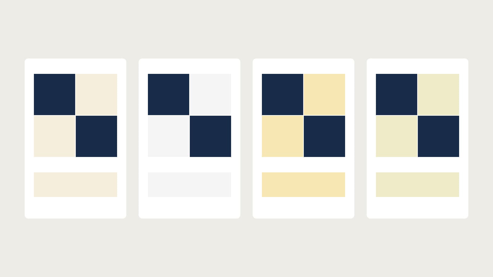
Suppose a two-color Four-Patch uses our original Navy screen value #182B49 and Cream #F5EEDC. We want a named light solid that keeps the intended contrast while giving us a fabric identity to check in person.
The production Pure Solids catalog displayed the following screen values. These are QuiltLab catalog previews, not manufacturer-certified measurements of fabric and not candidates asserted to have been ranked by the matcher:
| Swatch | Displayed hex | Question for the physical comparison |
|---|---|---|
| Original Cream target | #F5EEDC | Does this describe the light fabric already in the quilt? |
| Pure Solids Porcelain | #F5F5F5 | Does a more neutral-looking light preserve the intended warmth? |
| Pure Solids Buttermilk | #F7E7B3 | Does the more yellow-looking preview coordinate with the focus print? |
| Pure Solids Chamomile | #EFEBC8 | Does the slightly deeper-looking light give the background enough separation? |
All three names belong on a comparison list, not an automatic shopping order. We have not measured or handled these fabrics for this example.
The controlled study below holds Navy and the patch arrangement constant. In each version, the light occupies exactly half the patch area. For a 12-inch finished Four-Patch, each square finishes at 6 inches: two light squares occupy 2 x 6 x 6 = 72 square inches out of 12 x 12 = 144. Those are visible finished areas, not fabric requirements.
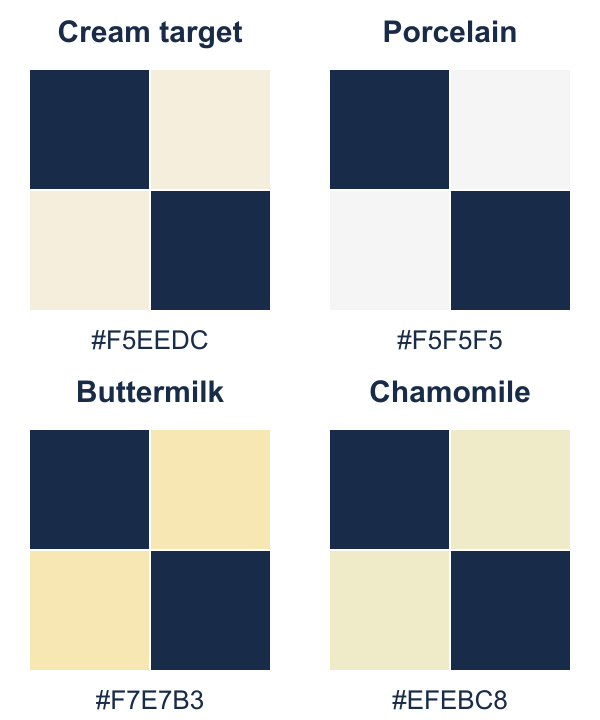
This removes a common distraction: one candidate looking quieter simply because you showed less of it. A tiny chip of Buttermilk beside a large field of Porcelain would be an unfair comparison of both color and proportion.
Make the final decision beside the neighboring fabrics
Set the shortlisted physical swatches against the actual dark and focus fabrics. Show approximately the share each will occupy in the design, and compare the alternatives under the same light. Check both the complete group and the exact boundaries where light and dark will meet.
Use a small written decision sheet:
| Check | Record before buying |
|---|---|
| Identity | Manufacturer, collection, name and product code |
| Role | Replacement, coordinator or digital-palette interpretation |
| Context | The actual neighboring fabrics compared with the sample |
| Light | Where you checked it, including the room where the quilt will be used |
| Remaining uncertainty | Sample needed, older card, existing fabric unidentified or retailer quantity unconfirmed |
If the goal is replacement, reject a noticeable mismatch even if the candidate is attractive. If the goal is coordination, a deliberate difference can be useful: a slightly warmer light might connect a navy block to a golden print. Record that as a design choice rather than calling it an exact match.
When two candidates remain close, revisit the intended role. A background needs to support the motif across a large area; a small accent has a different job. Our color theory guide explains that relationship, while the Kona Cotton fabric guide gives collection context for the shortlist.
Keep the identity after the purchase
Attach a small labeled scrap or a tag to each remaining piece and keep the receipt or product listing with the project notes. Record the actual color chosen, even when it differed from the original screen target.
The useful result is a shortlist you can explain and a final fabric you can identify again. Digital tools make the search manageable; physical swatches and the quilt's real neighbors settle the choice.
Related posts
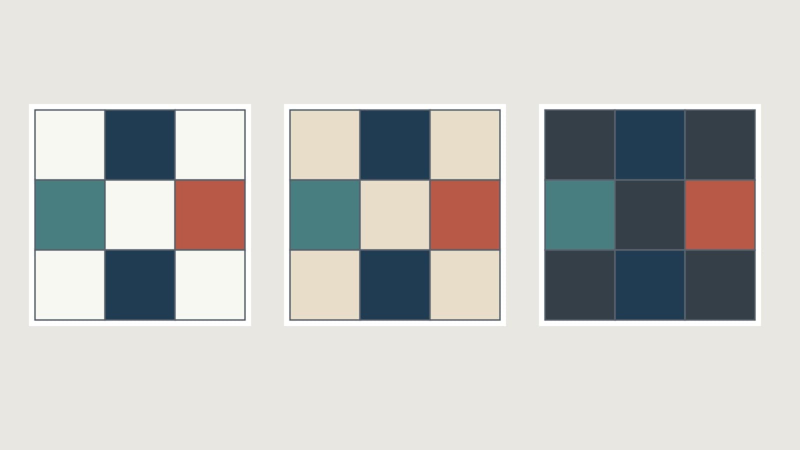
How to Choose Background Fabric for a Quilt
Compare contrast, undertones and print density, then test your background in the right proportion with a checked nine-patch example.
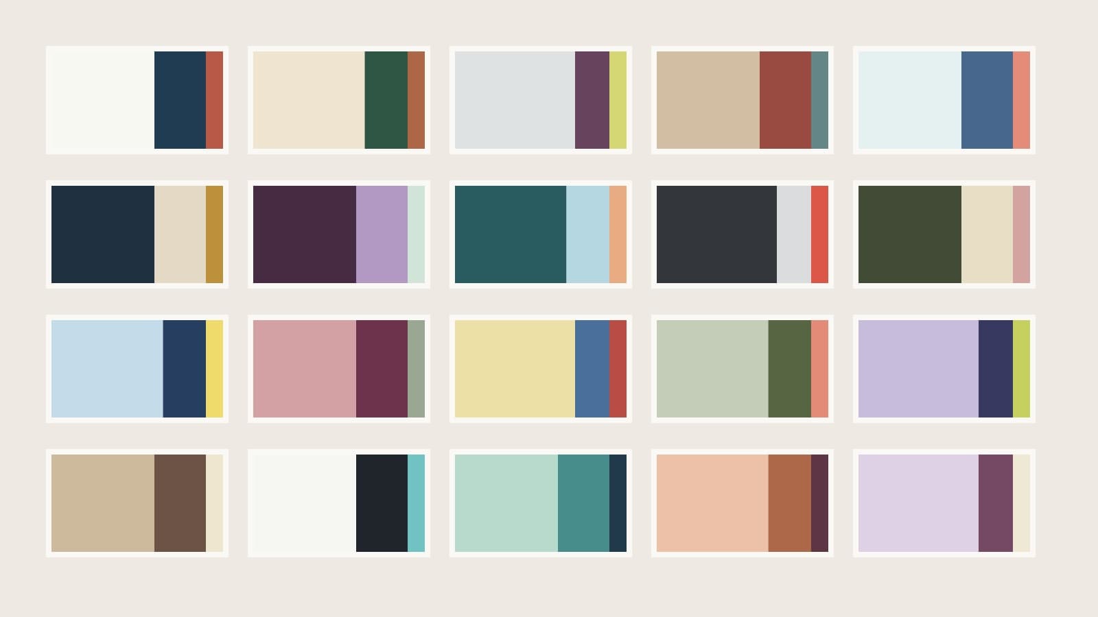
Quilt Color Combinations: 20 Palette Plans
Twenty quilt palettes with background, support and accent roles, checked area proportions and placement notes to help you choose fabrics.
How to Make a Scrappy Quilt Look Planned
Give mixed scraps a clear job, repeat them across the top, and check the counts with an original 36 x 45 inch nine-patch plan.