


Quilt Color Combinations: 20 Palette Plans
Quilt color combinations need color roles. A navy, cream and rust stack can make a light quilt, a dark quilt or a checkerboard depending on placement. Three attractive colors do not specify the design.
These twenty original plans assign background, support and accent roles, starting visible-area shares, and placement decisions. Adapt the briefs to your pattern; they are design proposals, not manufacturer shade matches or sew-tested quilts.
Read the recipes as roles, not shopping lists
In each plan, B is the background or dominant field; S supplies the repeated shapes; A is the small accent. The percentages are in that order. They describe visible finished patch area, excluding borders and binding, not yardage or the number of different fabrics.
Rebecca Bryan uses dominant, support and accent proportions in her analogous-color lesson, while also sorting fabrics by value. Here, 60/30/10, 65/25/10 and 70/20/10 are starting compositions, not rules you must force onto a pattern.
Buying fabric in 70/20/10 quantities cannot change a pattern with two equally sized roles. Follow its geometry or deliberately redesign the placement. Our color-theory overview covers hue and value definitions; this article puts specific combinations to work.
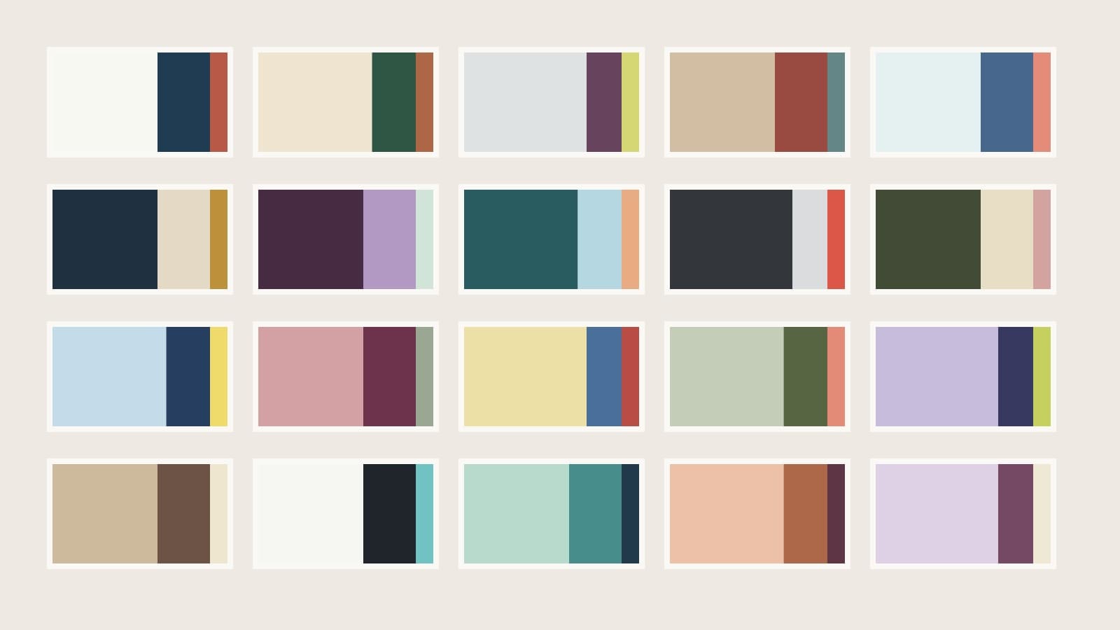
Cover cards follow article order: light, dark, colored and restrained palettes. Each card shows background, support and accent from left to right. The color names describe illustrative shades, not supplier products.
Five palettes with light backgrounds
1. Chalk, navy and rust
B chalk / S navy / A rust; 60/30/10. Let navy draw the repeating motif and use rust at selected centers. Keep a pale chalk field continuous. Check rust against navy at the small center edges; if they merge in value, leave a chalk separator where the geometry allows it.
2. Warm ivory, forest and copper
B warm ivory / S forest / A copper; 65/25/10. Repeat copper inside forest forms rather than sprinkling it into the ivory field. This keeps the warm accent associated with the motif. Audition the ivory beside every print: a very yellow ground can change the relationship of a muted green pull.
3. Pale fog, plum and citron
B pale fog / S plum / A citron; 70/20/10. Give plum the outlines and citron the smallest highlights. Place a plum boundary around pale citron when it nearly disappears against fog. A larger citron area would change the balance substantially, so start with center pieces rather than a wide edge band.
4. Oat, brick and dusty teal
B oat / S brick / A dusty teal; 60/30/10. Use brick for the repeated forms and teal at a regular interval. If brick and teal have similar values, separate them with oat at important edges. Muted colors can work together while still needing a clear light boundary to describe the piecing.
5. Pale ice, denim and coral
B pale ice / S denim / A coral; 60/30/10. Denim carries the repeated shape; coral marks every second or third motif in a planned sequence. Decide that interval before cutting. A single isolated coral unit may become the focal point, whereas repeated coral points create a route across the top.
Five palettes with dark backgrounds
Melissa Mortenson's color-combination guide on Polka Dot Chair gives warm/cool examples with a navy ground. Test the light motif and accent against your dark field; bright colors do not necessarily separate equally well.
6. Ink, pale linen and ochre
B ink / S pale linen / A ochre; 60/30/10. Let linen form the light shapes and place ochre in their centers. Keep the tips linen if ochre is too close in value to ink. The dark field becomes the dominant area; the pale patches supply the recognizable drawing.
7. Aubergine, lilac and pale mint
B aubergine / S lilac / A pale mint; 60/30/10. Use lilac for a repeating band and mint at its intersections. Mint and lilac may both read light, so let aubergine separate them where you need sharp edges. Avoid alternating equal amounts of the two pale colors if you want mint to remain a small highlight.
8. Deep teal, pale sky and apricot
B deep teal / S pale sky / A apricot; 65/25/10. Apricot centers interrupt a cool repeating shape. Surround them with teal when apricot and sky look similarly light. This layout lets the warm color recur while the dark field stays continuous, instead of turning every pale patch into an equally strong accent.
9. Charcoal, pale gray and tomato
B charcoal / S pale gray / A tomato; 70/20/10. Draw a chain in pale gray, then replace selected interiors with tomato to create a broken color path. Leave some motifs unaccented. Check tomato on charcoal at small edges: saturation makes it noticeable, but may not provide the value separation a pointed shape needs.
10. Dark olive, parchment and blush
B dark olive / S parchment / A blush; 60/30/10. Parchment outlines the main forms and blush occupies enclosed centers. If the two pale fabrics merge, make the olive boundary do the separating. Start with restrained blush placement; spreading it throughout the field changes which pale role leads the design.
Five palettes with colored backgrounds
11. Powder blue, navy and lemon
B powder blue / S navy / A lemon; 65/25/10. Navy supplies the corners or outlines; lemon sits within those dark forms. A lemon patch directly beside powder blue may lose its edge. Use the darker support fabric where the accent's boundary matters, rather than adding more lemon to compensate.
12. Dusty rose, burgundy and sage
B dusty rose / S burgundy / A sage; 60/30/10. Burgundy draws a continuous chain and sage marks chosen intersections. Make sure burgundy is dark enough to separate from the rose field. If the chain disappears, deepen that support role before introducing a fourth hue; another color will not repair the same boundary.
13. Butter yellow, denim and red
B butter yellow / S denim / A red; 70/20/10. Use medium-to-dark denim for the repeated forms, with small red centers. Keep red inside the planned accent share: a broad red border adds a new framing role and changes the whole composition. Count that border separately if you decide to use one.
14. Pale sage, olive and coral
B pale sage / S olive / A coral; 65/25/10. Dark olive edges can separate coral from the pale field. Choose the two greens far enough apart in value to hold the pattern. If the sage print has dark olive motifs of its own, audition those marks at the finished patch size before buying it as background.
15. Lavender, indigo and chartreuse
B lavender / S indigo / A chartreuse; 70/20/10. Indigo forms clear silhouettes; chartreuse appears as enclosed dots or centers. Keep a dark edge around those small highlights if lavender and chartreuse both read light. Audition a grayed chartreuse if the bright version attracts more attention than the motif should receive.
Five restrained palettes
16. Sand, cocoa and cream
B sand / S cocoa / A cream; 60/30/10. Use cream as the brightest accent at crossing points, rather than automatically assigning the lightest fabric to the background. Cocoa should outline those highlights when sand is pale. This is a useful role reversal: the accent can be quiet in hue but strong in lightness.
17. White, black and aqua
B white / S black / A aqua; 60/30/10. Black outlines the recurring forms and aqua replaces selected interiors. Limit aqua to one repeated type of piece so the color has a clear job. If the black fabric has white print marks, check whether those marks break up the outline in a small cut.
18. Seafoam, teal and ink
B seafoam / S teal / A ink; 60/30/10. Ink anchors selected intersections, with teal making a gentler repeating structure. Do not assume neighboring blue-greens separate sufficiently: choose a darker teal if seafoam and teal merge. Keep ink concentrated at the planned intersections instead of using it randomly wherever a scrap fits.
19. Peach, rust and deep wine
B peach / S rust / A deep wine; 65/25/10. Wine supplies occasional darkest centers; rust needs enough separation from peach to define the larger forms. Compare the three fabrics at the intended shares. A wide wine strip can dominate the view even when it is only one fabric in a three-fabric pull.
20. Pale lilac, plum and ivory
B pale lilac / S plum / A ivory; 70/20/10. Let plum enclose the ivory highlights. Pale lilac and ivory can look distinct in hue yet merge at a seam, so do not ask that pairing to define an essential point. Keep the plum shape legible first, then refine whether the lilac should lean warmer or cooler.
A checked 60/30/10 patchwork example
Take recipe 1 and plan a 10-by-10 grid of equal squares, each finishing at 3 inches. The top finishes at 30 by 30 inches, without borders. Begin with 60 chalk and 40 navy positions, then replace 10 of the navy positions with rust.
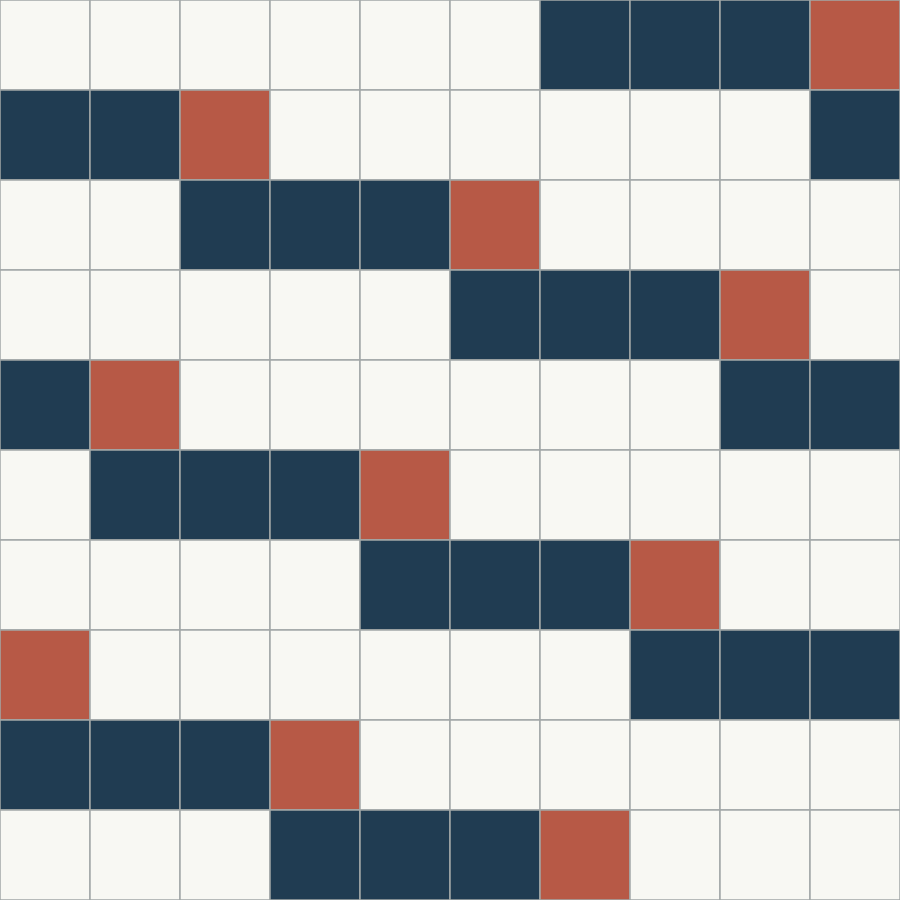
| Role | Equal squares | Visible finished area |
|---|---|---|
| Chalk background | 60 | 540 square inches |
| Navy support | 30 | 270 square inches |
| Rust accent | 10 | 90 square inches |
Each square contributes 9 square inches. The total is 540 + 270 + 90 = 900 square inches, matching 30 x 30. Because all squares are equal, their count shares and visible-area shares agree. A layout mixing triangles, large squares and narrow strips requires area calculations instead of simply counting pieces.
For quarter-inch square-piecing seams, these squares would be cut at 3 1/2 inches. Do not multiply a fabric-shopping total by the percentages: cutting layout, seams, waste and other quilt components affect fabric requirements. Follow your pattern or a separate checked cutting plan.
The diagram uses a regular shifting placement to distribute the accent. Its counts alone do not guarantee that another arrangement will read the same way. Gather the ten rust patches into one cluster and you create a stronger local focal point; scatter them without a placement plan and you may lose the repeating route. Choose both a palette and a placement rule.
Translate the plan into real fabric
Shannon Brinkley's value lesson explains how contrasting surrounding values emphasize a shape. Check those essential boundaries in your pull, especially the support against the background and the accent against whatever touches it.
Pull physical candidates for one recipe, fold them to approximate the intended shares, and place them together in the same light. A printed fabric can introduce colors outside its assigned role; check its darkest marks and lightest gaps through a finished-piece-size paper window. Descriptive names such as "denim" and "plum" cover many different values, so treat the proposed roles as the specification.
In QuiltLab's Block Editor, select the pieces you want to change before applying their fabric choice in the sidebar. Use a fixed existing design to compare placements; the Block Editor guide covers that workflow. For your own photographed fabric, the Swatch Editor guide explains uploading, checking dimensions and saving a swatch.
Use a digital preview to compare geometry and role distribution, then verify finalists with actual swatches. Screen illustrations cannot identify an exact dyed-fabric match. Choose a recipe that suits the pattern's contrast needs, then change one role at a time.
Related posts
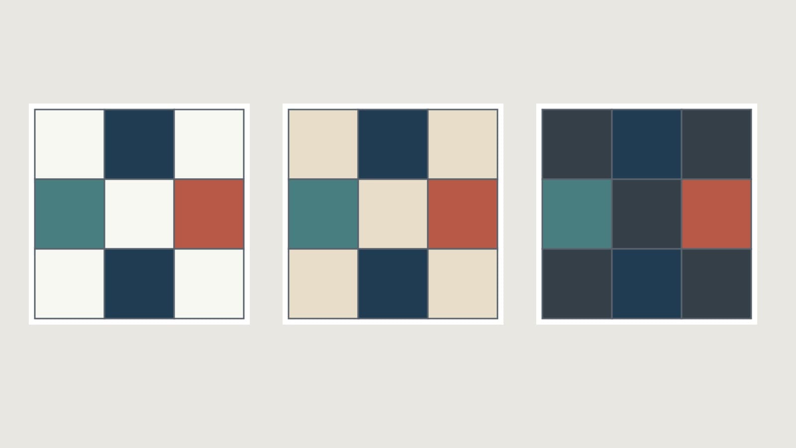
How to Choose Background Fabric for a Quilt
Compare contrast, undertones and print density, then test your background in the right proportion with a checked nine-patch example.
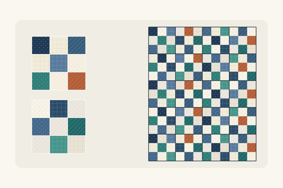
How to Make a Scrappy Quilt Look Planned
Give mixed scraps a clear job, repeat them across the top, and check the counts with an original 36 x 45 inch nine-patch plan.
Color Theory for Quilters: Value, Hue and Choosing Fabrics That Work
Most quilt color problems are value problems. This guide covers the four properties of fabric color, the classic schemes, and a fabric-pull process you can use on your next project.