


How to Choose Background Fabric for a Quilt
Learning how to choose background fabric for a quilt starts with the pieces that must remain visible against it. A white bolt may look harmless in the shop, then swallow the pale parts of your favorite print. A dark field can make those pale parts clearer while losing your navy patches instead.
The useful question is: which background lets this particular design read the way you intend? Keep the motif fabrics and geometry fixed, compare a few candidates, and judge the background at the amount it will actually occupy. This guide gives you a decision process and an original nine-patch study to make that comparison concrete.
Identify what the background has to do
A background is a role in the quilt top. It might be the small pieces surrounding a star, the squares alternating with colored patches, or a broad field around blocks. Backing is the fabric on the reverse side of the quilt; it is a separate decision.
In Make Modern's background-fabric article, an extract from Jane Kelly's Backgrounds, the background can extend across block units, sashing and larger areas. Kelly recommends auditioning other fabrics over a spread-out background. That matters because a background shown as a tiny folded strip understates its effect.
Before pulling candidates, write one sentence describing its job:
- "Keep the pale petals separate from the space around them."
- "Let the dark chain connect visibly across the quilt."
- "Give busy prints a quiet field without making the whole top stark."
Choose the sentence that fits your pattern. A deliberately subtle quilt may need gentle separation; a sharply defined star needs stronger separation at its points. You do not need to maximize contrast everywhere.
Test the weakest boundary first
Find the motif fabric most likely to merge with the background. It may be the palest print, the darkest solid, or a multicolor print containing the candidate background color. Put that fabric directly against each candidate before checking the easier pairings.
Shannon Brinkley's lesson on value shows how different surrounding values emphasize a shape. Apply that idea at the boundary your pattern depends on: if a point loses its edge, an attractive overall fabric stack does not solve the problem.
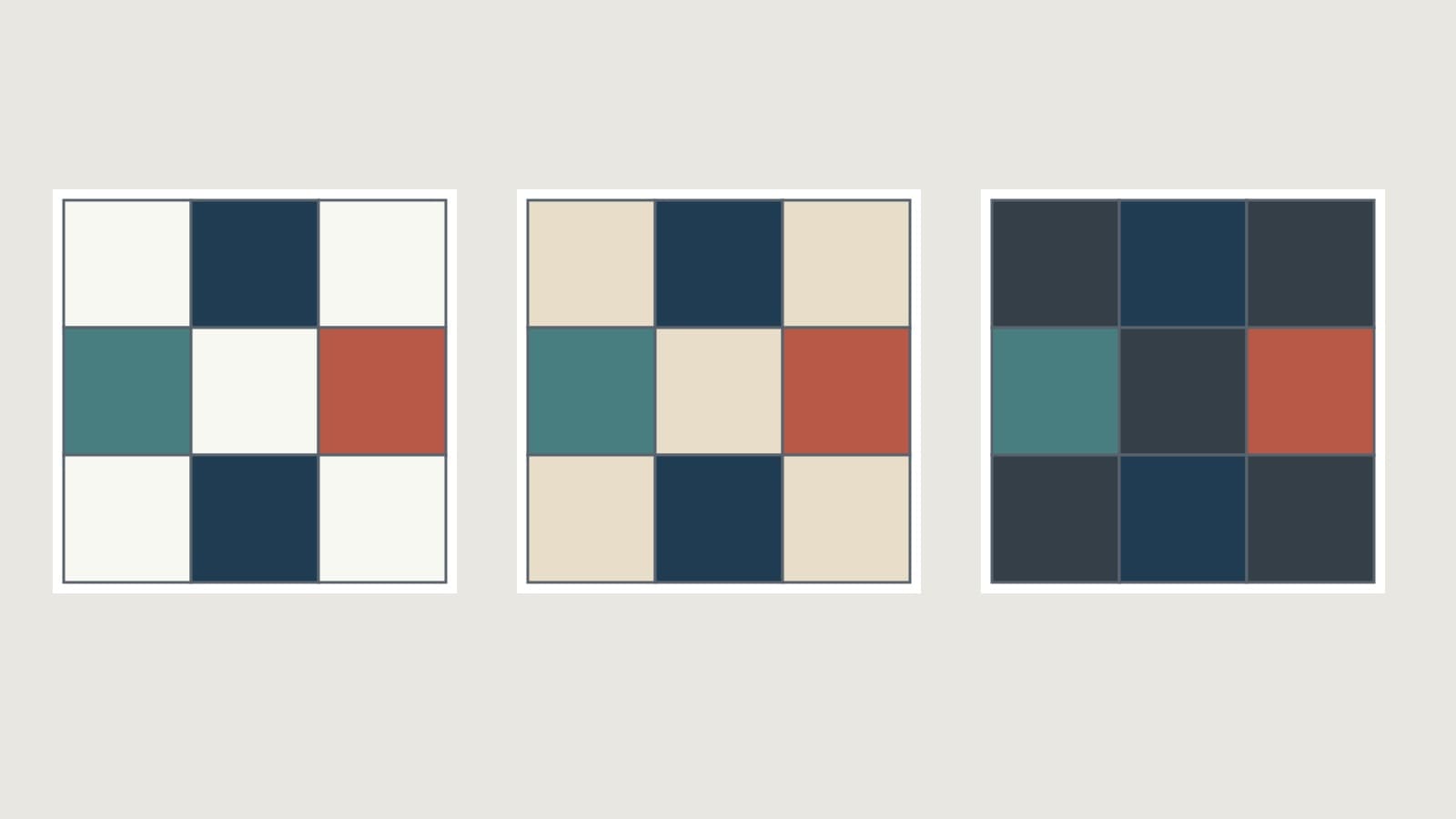
The cover illustration holds the four colored positions of one nine-patch constant. From left to right, the background is chalk, warm ivory and charcoal. The navy patches remain distinct on both light fields and become harder to separate from charcoal. The teal and coral still have their own relationships with each field. These are screen-color studies, not photographs of cloth or sewn blocks.
To repeat the test with fabric:
- Lay down a generous piece of each background, one candidate at a time.
- Place the actual motif fabrics on top in roughly their planned proportions.
- Look at the pale, middle and dark motifs separately. Check each important edge.
- Step back far enough to see the whole arrangement rather than individual printed details.
- If two candidates survive, make a sample block with the pattern's smallest critical pieces before buying the full background amount.
A phone photo viewed in monochrome can help you judge light and dark relationships. That is a separate photo-tool check, not a QuiltLab grayscale control. Our color-theory guide explains the broader value and hue principles.
Compare undertones after contrast
White, cream, gray and black are not interchangeable backgrounds. A creamy white beside a cool pale print may look yellower than it did alone. A blue-leaning gray can feel different beside rust than a warm gray does. These relationships are reasons to audition, not rules that a warm quilt must use cream or a cool quilt must use white.
Hold each candidate beside every motif fabric in the same light. Then answer two questions: does it preserve the necessary edges, and do you like the color relationship across the entire pull?
If chalk and ivory both keep the shapes readable, either may work. Pick the relationship you prefer. If the ivory looks pleasantly warm beside one print but makes another pale motif indistinct, return to the boundary test. A pleasing undertone cannot restore a lost shape.
Avoid choosing from separate shop photographs on different screens. Compare physical swatches together before committing to a particular shade. A digital mockup helps with layout; its displayed color is not a guaranteed match to dyed fabric.
Decide how much print the background can carry
Fat Quarter Shop's Background Builder distinguishes solid, tone-on-tone and low-volume options. They give you different starting points:
| Candidate | What to check in your design | Useful first audition |
|---|---|---|
| Solid | Every motif boundary is exposed clearly | Busy motif fabrics or small detailed piecing |
| Tone-on-tone | The printed texture does not form a competing pattern | A broad field that needs some texture |
| Low-volume print | Dark marks do not interrupt pale motif edges | Dark or saturated motifs against a light field |
A low-volume print is not automatically quiet in every patch. A black word, dot or tiny flower can dominate a small square even when the fabric reads pale across a yard. Check several parts of the repeat through a paper window the size of the finished piece. A three-inch window asks a different question from a six-inch one.
For a first audition, change only one variable. Compare three solids to choose the background value and undertone. Then compare a solid with a similarly colored quiet print. If you change color, value and print density together, you will struggle to identify why one candidate works better.
A worked example: the background is over half the top
Consider an original nine-patch with five background squares and four motif squares. Each square finishes at 3 inches, so each block finishes at 9 inches. Arrange 12 blocks in three columns and four rows, with no sashing or borders. The planned finished top is 27 by 36 inches.
The five background positions sit at the corners and center of every block. Two navy positions, one teal and one coral occupy the remaining four positions. Repeating the block keeps these placements fixed while you compare backgrounds.
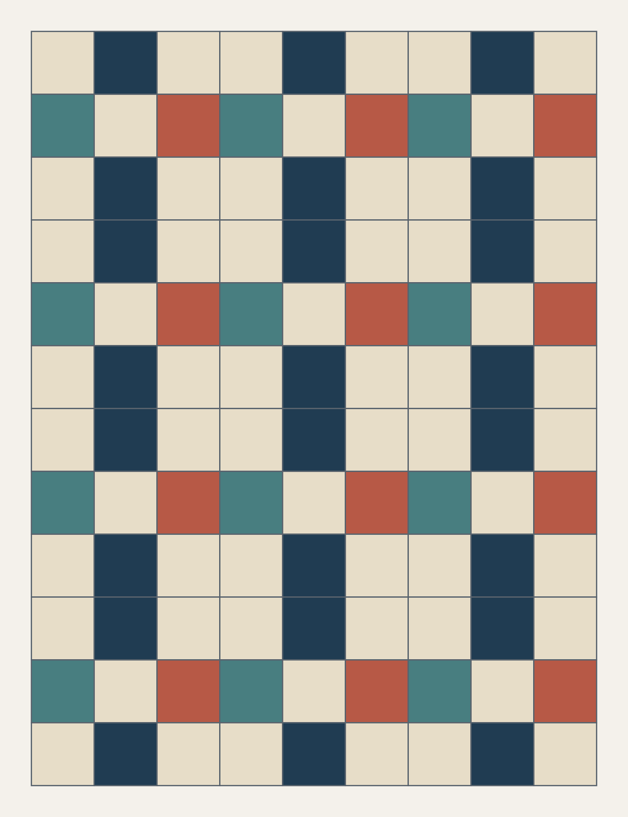
There are 12 x 9 = 108 squares in total. Each finished square contributes 3 x 3 = 9 square inches:
| Role | Number of squares | Visible finished area |
|---|---|---|
| Background | 12 x 5 = 60 | 60 x 9 = 540 square inches |
| Colored motifs | 12 x 4 = 48 | 48 x 9 = 432 square inches |
| Whole top | 108 | 972 square inches |
The area check agrees: 27 x 36 = 972 square inches. The background occupies 540 / 972, or about 55.6% of the visible top. Audition it as more than half your display, not a narrow strip beneath a stack of colorful fabrics.
For square piecing with quarter-inch seams, the individual squares would be cut at 3 1/2 inches. That cut size is separate from the finished-area comparison. The 55.6% figure is not a yardage split: seam allowances, cutting layout, waste and any changes to the pattern affect how much fabric you need. Use your actual pattern's requirements when purchasing.
Use a mockup to isolate the decision
You can compare candidates in QuiltLab without changing the pattern geometry. In an existing Block Editor design, use Select to select the pieces whose fabric you want to change, then use the sidebar's fabric choices. Keep the other pieces fixed while you compare one background at a time. The Block Editor guide covers the selection and fabric-assignment steps.
If you photograph fabric for the comparison, use File > Upload Image in the Swatch Editor, crop the image, and check its dimensions before using it in a block. Follow the Swatch Editor guide; a newly uploaded image needs its first Save and name before it becomes a saved swatch.
A photographed print with incorrect dimensions can give a misleading impression of density. Even a correctly sized preview still depends on lighting, photography and your display. Recheck the finalists against physical cloth, especially at the small pieces and pale boundaries that prompted the decision.
A background-selection checklist
Before purchasing, confirm that:
- The weakest motif boundary remains as visible as your design requires.
- The background's undertone works beside the whole pull in the same light.
- Printed marks behave at your smallest finished piece size.
- Your audition shows the approximate background share of the top.
- The choice still works in a sample block when the design depends on a delicate edge.
If one background fails, name the failure before changing it: "navy merges into charcoal" is actionable; "the quilt feels wrong" is harder to fix. Keep the motifs steady, change the background, and repeat the same comparison.
Related posts
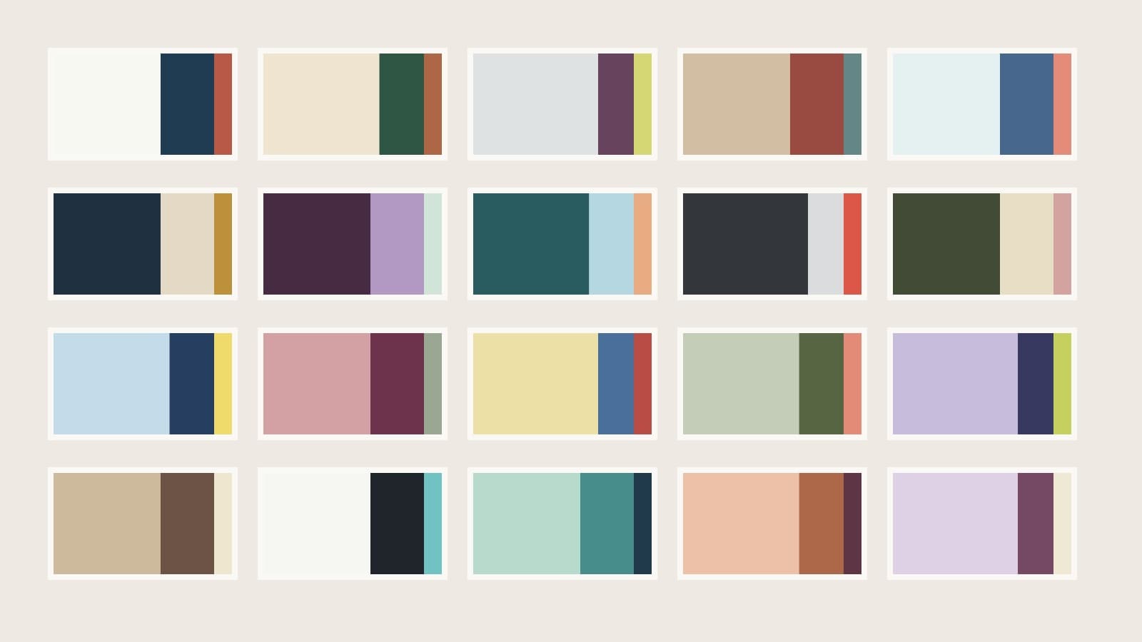
Quilt Color Combinations: 20 Palette Plans
Twenty quilt palettes with background, support and accent roles, checked area proportions and placement notes to help you choose fabrics.
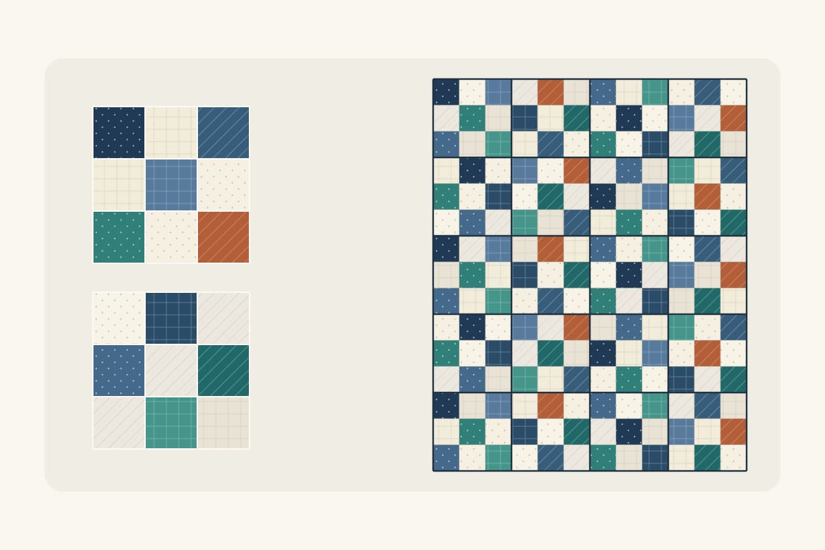
How to Make a Scrappy Quilt Look Planned
Give mixed scraps a clear job, repeat them across the top, and check the counts with an original 36 x 45 inch nine-patch plan.
Color Theory for Quilters: Value, Hue and Choosing Fabrics That Work
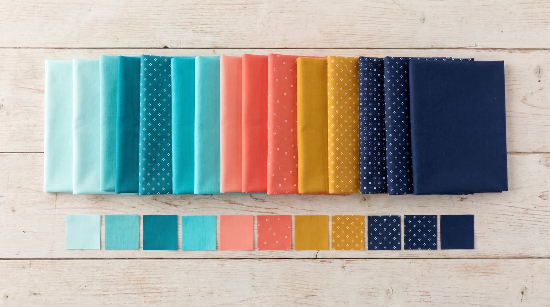
Most quilt color problems are value problems. This guide covers the four properties of fabric color, the classic schemes, and a fabric-pull process you can use on your next project.