


How to Plan a Colorblind Friendly Quilt Design
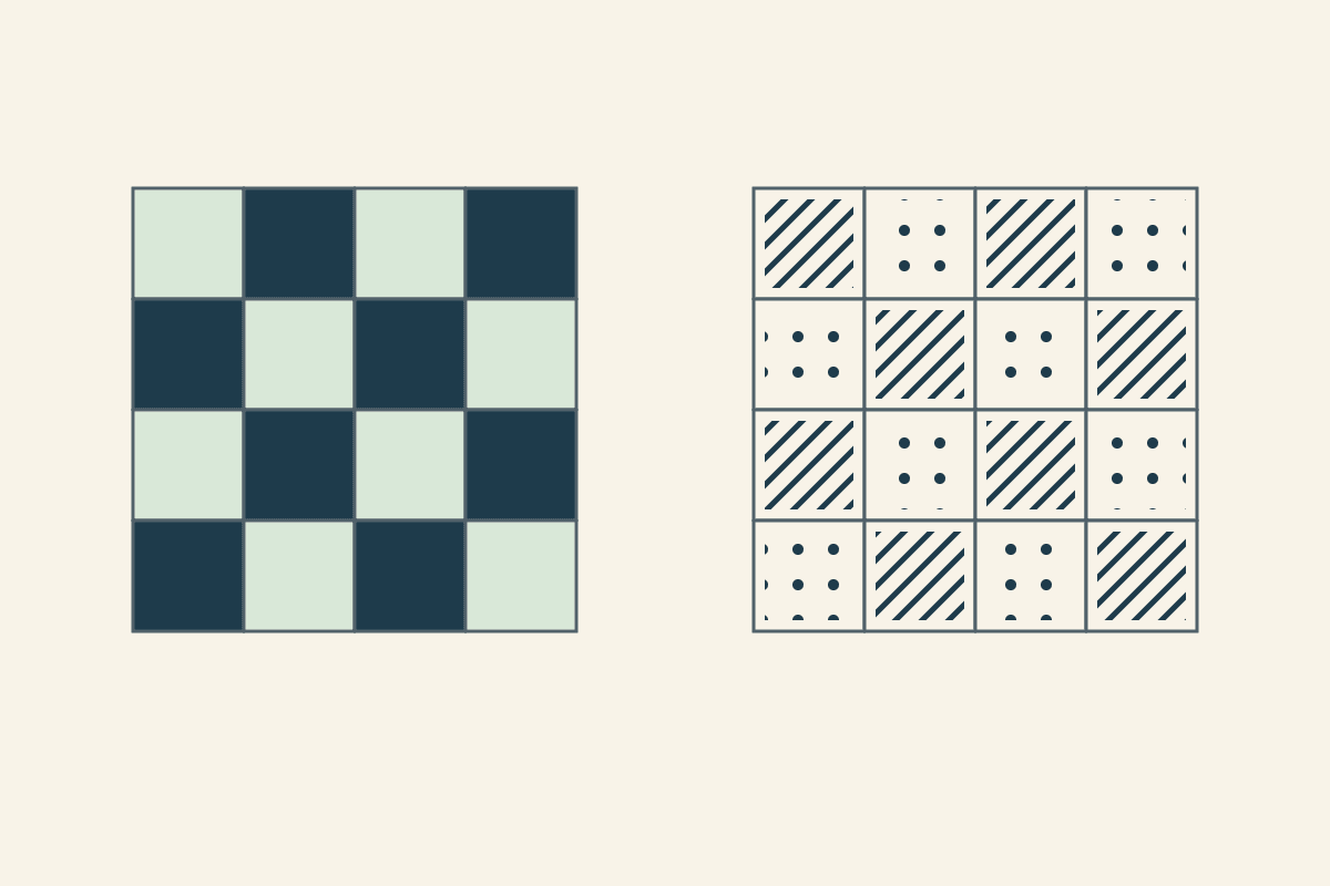
Give fabrics a clear light-dark difference where the design needs an edge, then check those fabrics together at the size they will appear. Use letters or symbols as well as color in your placement plan. If you're making the quilt for someone with a color vision difference, ask what they can distinguish and what they enjoy before settling the pull.
You can still use a colorful palette. The aim is to make important relationships readable without requiring someone to tell two hues apart. A favorite red and green can remain in the quilt while a lighter fabric, a darker outline or a different print helps separate their jobs.
Start with the person and the quilt's job
Ask a practical question: "Which parts of this arrangement are easy to tell apart?" Show the actual fabrics together when possible. A person's answer is more useful than assuming their experience from a label.
The National Eye Institute explains that color vision differences vary. Red-green differences are the most common, but there are other types, and the colors someone finds difficult depend on that difference. A single screen simulation cannot stand in for every viewer.
Choose what you need the design to communicate. Perhaps the star should stand out from its background, or a repeated path should stay visible across the quilt. A blended watercolor effect asks something different from a crisp chain.
Write that aim beside the fabric pull: "Keep the dark chain easy to follow; let the small warm prints vary." You now know which edges deserve the closest attention.
Give each fabric a job before choosing its name
Begin with two roles, such as light field and dark structure. Pull candidates for those roles, then compare their actual marks and gaps. "Blue" is a color family; it doesn't tell you whether a particular blue print can carry the dark structure.
Tom of The Colourblind Quilter describes using strong contrast and avoiding close values when building his palettes. His palette notes offer a useful starting point. Compare your actual fabrics with the intended viewer rather than assuming a named palette suits everyone.
Fold your candidates to show roughly the amount each will occupy. Place a paper window over a busy print at the intended finished patch size. A cream print with a large navy flower can behave very differently depending on where that window falls.
For a first pull, choose a quiet light and a clear dark before adding the third fabric. Our color-theory guide explains the difference between hue, value and saturation if those terms are still new.
Check the edges that carry the design
Lay the two fabrics side by side in even light. Step back until they are closer to the size you expect to see from across the room. Can you still identify the boundary that matters?
Then check the next pair. A strong difference between the lightest and darkest fabrics doesn't settle the relationship between two middle-value prints. Focus on fabrics that will actually touch.
Our grayscale value check shows a phone-photo method for looking at light-dark relationships. Use that as one additional view of the pull. Removing hue from a photograph does not reproduce a particular person's color vision, and the real fabrics still need to be checked together.
If a key edge disappears, try a quieter background or move one fabric to a different role. Adding another bright color can make a pull more colorful while leaving the same weak edge unresolved.
Keep the placement plan readable without color
A planning diagram can use information that won't appear in the cloth. Give every role a short ID, such as A for field and B for structure. Use that same ID in the key, cutting notes and placement map.
Add a different symbol or hatch to each role when the plan needs another visible distinction. A diagonal mark and a dot are easier to tell apart than two nearly identical gray fills. Keep the marks large enough to survive a phone screen or a printed copy.
The W3C's Use of Color guidance makes this principle clear for digital information: color should have another visible cue when it carries meaning. We can apply that idea to our placement notes. It doesn't certify the finished textile or replace a fabric comparison.
Keep the key short. "A, light field, diagonal mark" is easier to follow than a dozen similar pastel names. If you change the fabric for A, update its swatch and description while keeping the role ID consistent.
Work a sixteen-cell placement map
For the drawing below, use a four-column, four-row arrangement. Alternate A and B, beginning with A at the upper left. The next row begins with B. Each row contains two of each role, giving eight A cells and eight B cells across the sixteen positions.
We drew this study for the article and haven't sewn it. The letters and marks belong to the plan; they aren't instructions to print labels onto the quilt.
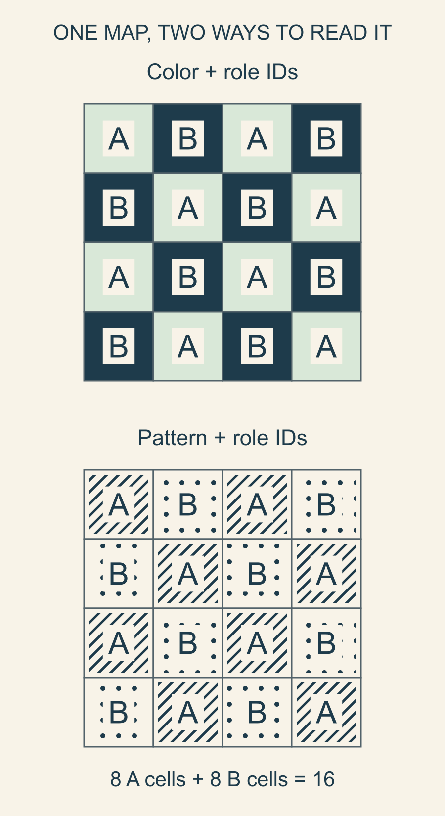
Suppose the actual pull contains six usable light pieces for A and eight dark pieces for B. The map still needs eight of each. You are short two light pieces, even though the dark pile is complete. A readable key helps you find the shortage before you sew.
Choose another fabric that can do A's light-field job, or deliberately change the design. Don't put an uncertain medium into the pile just because its color name resembles the first light.
If two different light prints supply A, retain the A role while adding fabric IDs A1 and A2 to your notes. The placement map can then show where each print goes without confusing the role count with the number of fabrics.
For the shortage above, call the six existing light pieces A1 and the two additional light pieces A2. Put A2 at row one, column one and row three, column three. Both are A positions. The other six A positions use A1, and all eight B positions stay unchanged. You now have six A1 + two A2 + eight B = sixteen pieces, still serving eight A and eight B roles.
Check the plan in the form you'll use
Open the diagram on the phone or tablet you will have beside the machine. If you plan to print it, print a small proof. Check that letters, symbols and boundaries remain clear at that size.
Cover the color key briefly and try following one row using only its role IDs. Then ask someone else to locate a named position, such as row three, column two. That position is B in this map. If they have to guess which fill means B, simplify the key.
Use the same orientation throughout: row one at the top, column one at the left. A small upper-left marker can prevent an otherwise clear map from being turned around during assembly.
Before cutting the full quilt, settle three things: the actual fabrics separate where you need them to, the placement key works at your reading size, and the recipient has had a chance to respond. Start with one block or a small section, keep its role IDs beside it, and revisit any edge that becomes hard to read.
Plan your next quilt
Lay out blocks and try colors in QuiltLab's grid editor before you cut.
Free forever, no card needed.
Get quilting tips by email
QuiltLab updates, tips and quilting inspiration. Unsubscribe anytime.
Related posts
Choose Quilting Thread Color to Blend or Stand Out
Hold the quilting path still while comparing colors, read exact thread specifications, and make a labeled sample with your actual fabrics.
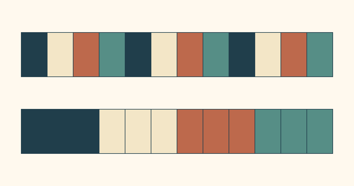
Scrappy Quilt Binding: Plan the Color Rhythm
Give leftover binding strips a deliberate order. Compare repeated and grouped colors, allow for joins and audition the sequence around a 40 x 52 quilt.
Monochromatic Quilts: Choose Prints That Stand Apart
Choose four blue prints by their jobs, then compare value and print scale separately. An equal-coverage dot swap shows why both matter.