


Grayscale Value Check: Which Quilt Fabrics Will Blend?
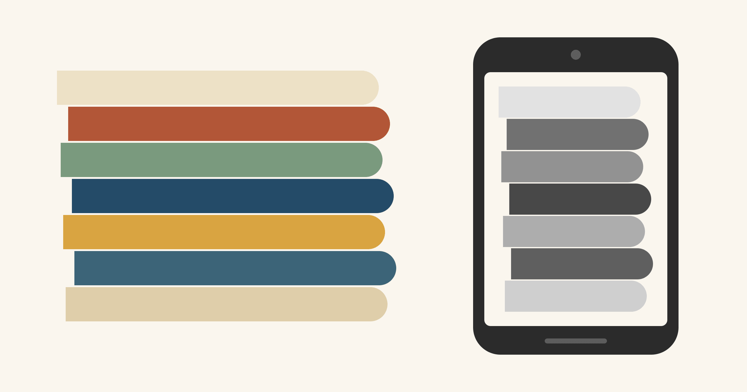
To check value, lay your fabrics side by side, take a photo in even light and switch it to black and white. Any two fabrics that turn the same gray will blend where they touch, however different their colors look. The American Quilter's Society blog describes the same test with a grayscale photocopy or a camera's black-and-white setting. The usual goal is a mix of lights, mediums and darks. That's the blend a QuiltCon color value class asked students to bring, reports Leslie of The Seasoned Homemaker. We'd add one step: check each pair of fabrics that shares a seam. A pull can show a good range while one block still loses its shape.
Below you'll find what the photo removes, how to take it so the grays are fair, and a seven-fabric example worked through a 12 in. Friendship Star. For the wider picture of hue, saturation and print scale, start with our color theory guide.
What disappears when you remove hue
A black-and-white photo strips out hue (red versus blue, warm versus cool) and saturation (clear versus grayed). What's left is value, how light or dark each fabric is, plus the pattern printed on it. A pieced block is drawn in value, so the photo shows you the drawing without the paint.
The surprises come from how unevenly our eyes weigh colors. The relative luminance formula in the W3C's WCAG 2.2 standard counts green light about ten times as heavily as blue and more than three times as heavily as red. So yellows hold onto their lightness, blues drop dark, and a strong red or orange often lands in the middle grays.
Saturation fools the eye too. When Gwen Lanning sampled seven colors from her butterfly quilt and converted them to gray, she found only five distinct values. The gold, orange and light plum were "all very close in value." Her conclusion at Deep in the Heart of Textiles: "I think it's common for us to believe that more saturated colors are actually lighter than they are."
The biggest loss is the contrast between opposite colors. Blue and orange look like opposites, yet they can turn nearly the same gray. The example below shows exactly that.
How to take a grayscale photo you can trust
In Leslie's QuiltCon class, the instructor had students photograph their fabrics with their phones and convert the pictures to black and white. Her verdict: "You can instantly see the color value differences." A few habits keep the grays honest:
- Overlap the fabrics. Jennifer Houlden overlaps hers "so that there are no gaps in between the fabrics," which keeps the table from showing through (QUILTsocial). Show each fabric in roughly the share it will have in the quilt.
- Use even light. Shoot in daylight from a window, with no flash, holding the phone straight over the fabric. Glare or a shadow across one fabric changes its gray.
- Convert with a plain filter. Use your photo app's basic black-and-white filter, or drag saturation all the way down. Skip the high-contrast black-and-white looks. They stretch some grays apart and squeeze others together, so the spacing you see isn't the real one.
- Look at it small. Shrink the photo or hold the phone at arm's length, closer to how a quilt is seen across a room. Houlden says squinting "can be used in a pinch," but the photo is easier to read.
- Compare inside one photo. Your phone sets exposure and white balance for each shot. A gray in one photo can't be matched against a gray in another. When you swap a fabric, photograph the whole group again.
A worked example: seven solids in color and in gray
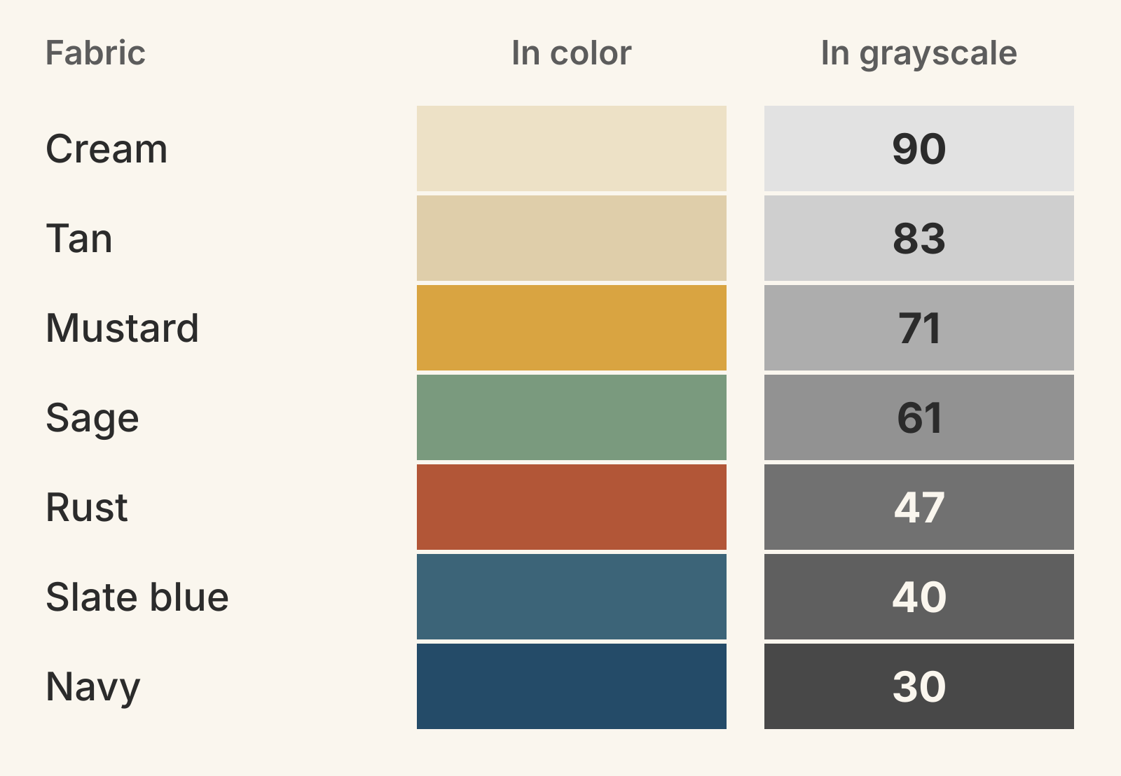
Say you've pulled seven solids for a throw of Friendship Stars: cream, tan, mustard, sage, rust, slate blue and navy. We turned each color into gray with the WCAG weights, then gave each gray a lightness number on the CIE lightness scale, which runs from 0 (black) to 100 (white). Your phone's filter will give slightly different grays. We drew these diagrams for this article and haven't sewn them.
| Fabric | Lightness (0-100) | Group in this pull |
|---|---|---|
| Cream | 90 | Light |
| Tan | 83 | Light |
| Mustard | 71 | Medium |
| Sage | 61 | Medium |
| Rust | 47 | Dark |
| Slate blue | 40 | Dark |
| Navy | 30 | Dark |
As a whole, this pull passes. It runs from 30 to 90, no two fabrics share a gray, and neighbors on the ladder sit 7 to 14 points apart. The groups come from the two widest gaps: 12 points between tan and mustard, and 14 between sage and rust.
Two results you might not predict from the color version:
- Mustard isn't a light. It's the most saturated fabric in the pull and looks the brightest, yet tan and cream are both lighter.
- Rust belongs with the darks. In color it looks like a warm medium. In gray it sits 7 points above slate blue and 14 below sage.
Check every pair that shares a seam
A pull's range doesn't tell you whether a block will read. That depends on which fabrics touch. Take a 12 in. finished Friendship Star: nine 4 in. finished units, made of a center square, four half-square-triangle side units and four plain corners. The star (the center plus four triangles) covers 48 of the block's 144 square inches. The background covers the other 96, two thirds of the block, so give it two thirds of the photo.
Here the star is rust, tried on three backgrounds from the same pull.
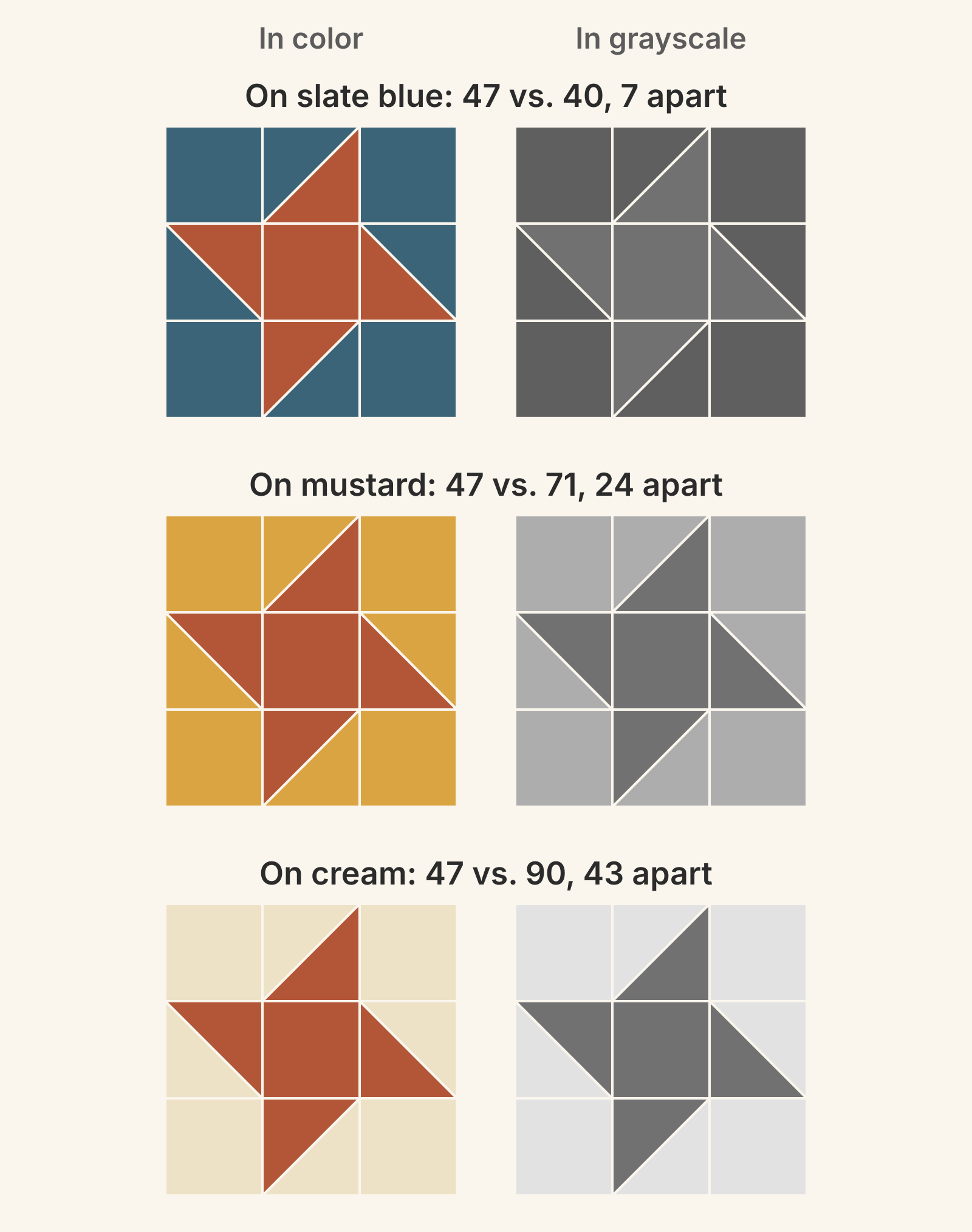
- Slate blue, 7 apart. In color this is the boldest of the three pairings. Rust and slate blue sit almost opposite each other on the color wheel. In gray, the star barely separates from the background.
- Mustard, 24 apart. Rust and mustard are neighbors on the color wheel, a quiet pair you might pass over. In gray, the star reads clearly.
- Cream, 43 apart. The crispest star of the three.
The pairing with the most color contrast has the least value contrast. That's the whole reason to take the photo.
There's no standard number for "enough," so let the photo decide. If you have to look twice to tell which of two grays is darker, the edge between them will blur from across a room. In this pull, the closest pairs are 7 points apart: cream and tan, and rust and slate blue. Any two fabrics two or more places apart on the ladder differ by at least 17 points. So here, when a shape has to read, skip its next-door neighbor on the ladder.
This block has one pair to check: star against background. A whole quilt adds more, such as block against block along shared edges and the outer blocks against a border. For placements in specific blocks, see our Sawtooth Star and Courthouse Steps color guides.
When you want fabrics to blend
Close values are useful when blending is the goal. The AQS blog notes that "same or close color values allow your varied fabrics to appear visually the same" in the tree trunks, leaves and faces of a landscape. A scrappy background works the same way: several creams and tans that land near one gray read as a single field, while their hues add interest. Our low volume fabric guide shows where light prints can blend and where they need a value step. A two-color quilt doesn't need a long ladder either. Lanning gives classic red-and-white quilts and indigo-and-white coverlets as examples.
Value is also relative. Leslie found that one print acted as the light in one pairing and as the dark in another. Houlden moved a fabric beside a darker neighbor and it no longer looked as dark. Photograph each fabric in the company it will keep, and audition the background against the actual block fabrics.
Give large prints and bundles a second look
- Large prints carry several values. A big floral can be dark in one corner and pale in the next. The AQS advice is to judge large prints by "the sections upon which you will be focusing." Fold the print down to the area you'll cut before you photograph it.
- Bundles can be short on lights and darks. After her class, Leslie found that "fat quarter bundles, charm packs, etc. tend to be mostly medium value fabrics." Photograph a bundle before you plan a design that needs strong lights or darks.
Run the check before you cut
- Photograph the pull and sort the gray version into a ladder, lightest to darkest.
- Mark any fabrics that turn nearly the same gray.
- List the pairs that share a seam where a shape must read. Check that you can tell at a glance which fabric in each pair is darker.
- Swap one fabric at a time, and photograph the whole group again after each swap.
- Lay out or sew one block and photograph it in color and in gray before you cut the rest.
If you plan on screen first, QuiltLab can hold the audition. Upload a photo of each fabric in the Swatch Editor and set its size. Draw the block in the Block Editor, then select the background pieces together and change their fabric to try each candidate. QuiltLab has no grayscale view. Take a screenshot of each version and convert it with your phone's or computer's photo tools, as you would a fabric photo. The screen colors come from your fabric photos, so confirm the final pair with the real fabrics in one photo.
Block Editor guide →Draw pieces, assign fabrics and save blocks for your quilt layoutsRelated posts
Irish Chain Quilt Colors: Which Fabric Goes Where?
Most Irish Chains put darker chain fabrics on a light background. Compare single and double chain value maps and see which fabric shapes the diamonds.
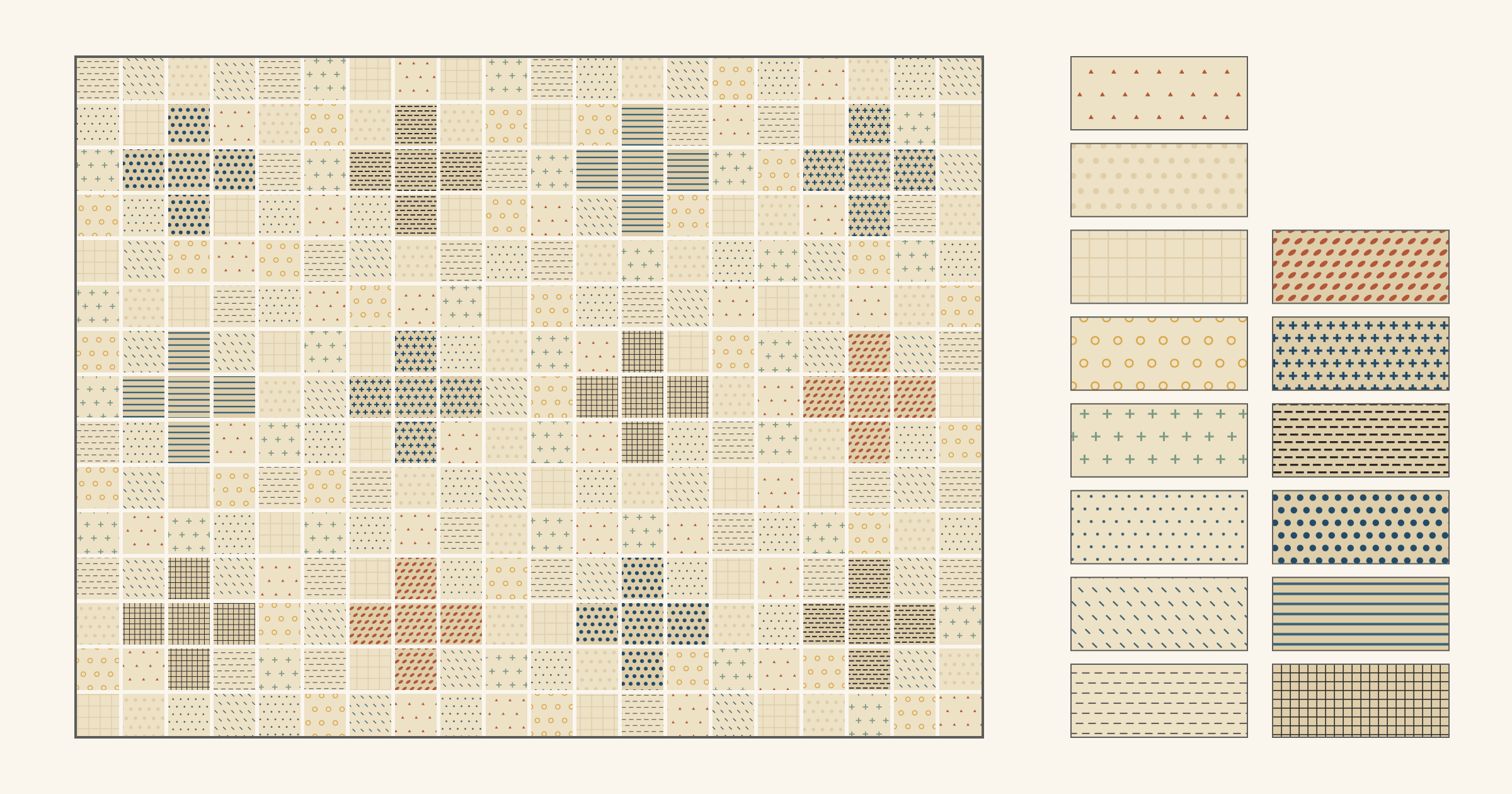
Low Volume Quilt Fabric: When Do Quiet Prints Need Contrast?
Light prints can blend in the background but need a value step wherever they form the design. Sort them into two groups and follow a 45 x 60 inch plan.
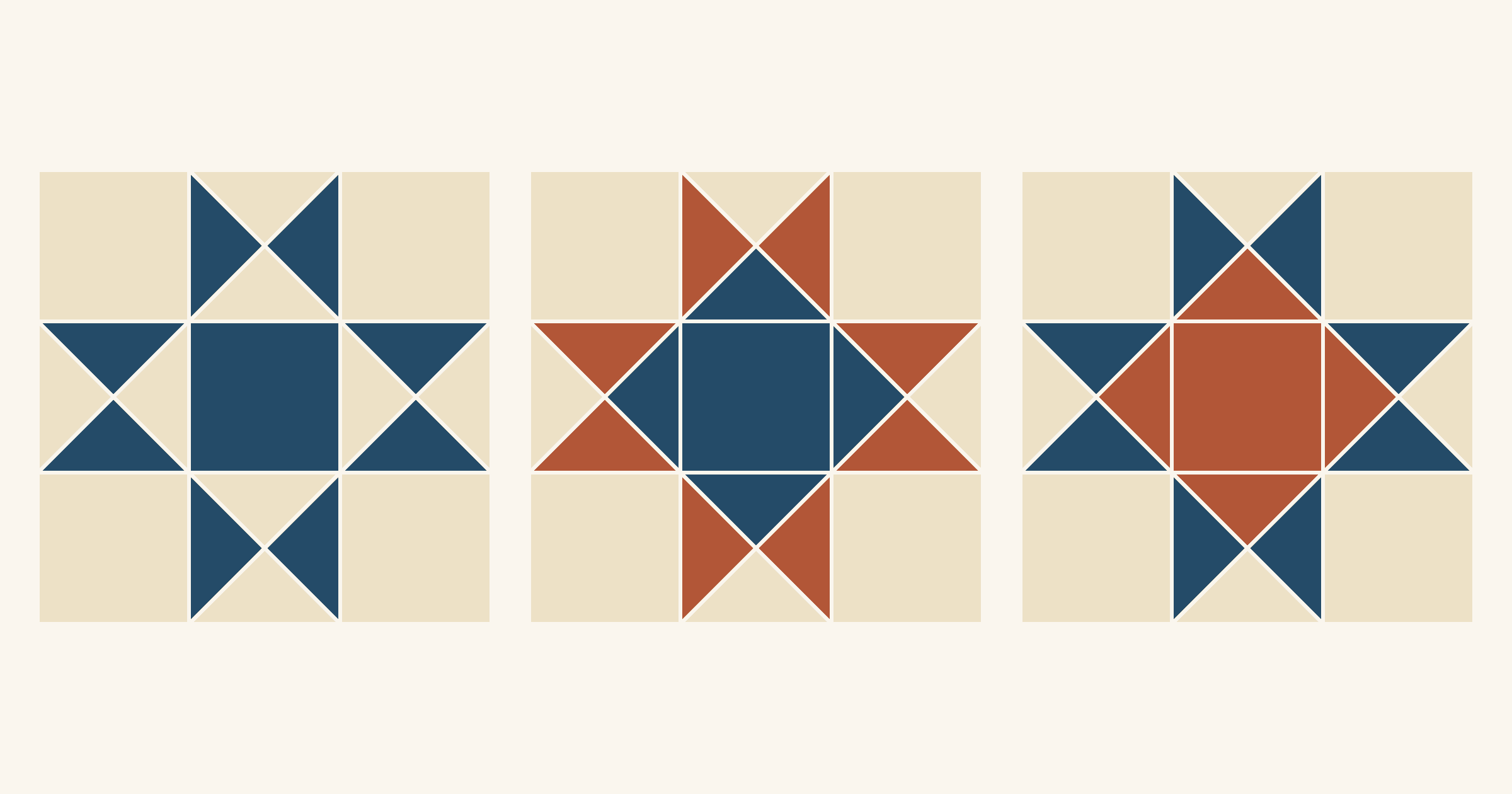
Ohio Star Quilt Block Variations: Will the Star or Center Stand Out?
Many Ohio Star variations keep the same nine-patch and move the fabrics. Compare four color maps on one 12-inch star and see why value decides what you notice first.