


Monochromatic Quilts: Choose Prints That Stand Apart
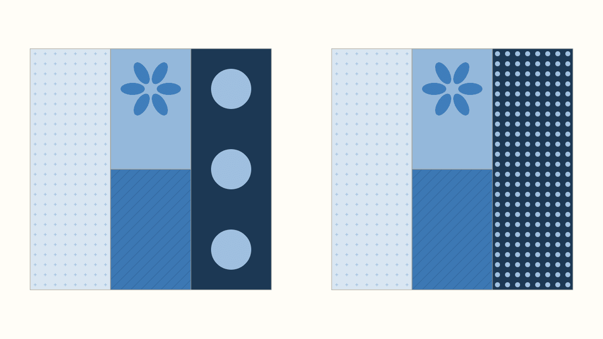
For monochromatic quilts with clearly readable pieces, choose lighter and darker versions of one hue, then give each print a job at its actual finished piece size. Start with a quieter light, a quieter dark and one print you want to feature. Add another fabric only when the pattern gives it a useful role.
A pile of blue fabrics can still be hard to use together. Some blues merge in value, while a large pale mark can attract more attention than the fabric's dark ground suggests. We'll separate those decisions with four blue prints and one controlled print-scale swap.
Set the one-hue brief before choosing every print
Choose the color family you want the quilt to explore: blue in our example. Lighter, darker, clearer and more muted versions can all belong to that brief. You don't need an exact dyed-color match between every fabric.
Rebecca Bryan's monochromatic quilt guide uses the tints, tones and shades of one color, with both prints and solids. She compares closely related values with stronger light-to-dark contrasts. Choose the effect you want before sorting the pull: softly blended pieces and clearly separated pieces ask different things of the fabrics.
For this study, we want four positions to remain recognizable, with the flower as the featured print. That gives us a reason to look for a range of blues and quieter neighbors.
Inspect the colors inside each print too. A blue ground with blue marks fits a different brief from blue with coral flowers. In her print-color lesson, Bryan distinguishes tonal prints using versions of one color from fabrics introducing additional hues. You can broaden your brief if you like; write down the change rather than treating every mostly-blue print as equivalent.
Give the prints four specific jobs
Our finished study is a 12-inch square divided into four rectangles:
- A: a pale, fine-print rail on the left, 4 x 12 inches.
- B: the flower window at upper center, 4 x 6 inches.
- C: a quieter window below it, 4 x 6 inches.
- D: a dark rail on the right, 4 x 12 inches.
We drew these hypothetical blue prints and finished-area studies and haven't sewn them. They are not fabric products or cloth photographs; compare your actual candidates together because screen color cannot guarantee a cloth match.
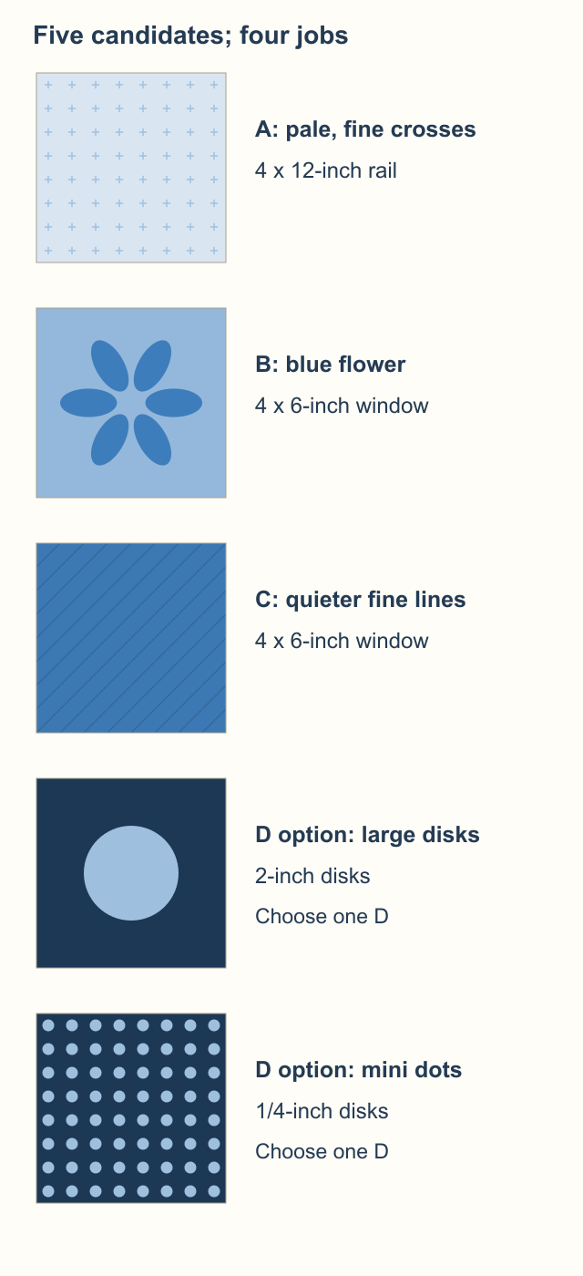
A's small crosses add texture to the pale rail. B's flower earns a place where its shape has room. C's fine lines give the second center window a different surface without another large motif. D supplies the darkest rail, but we'll compare two ways of printing its pale marks.
In Kimberlee Tanner's fabric-selection lesson at On Williams Street, scale belongs to the print's motif and must be considered against the pieces in the pattern. That is why the relevant window is four inches wide here, even though the whole block is twelve inches.
Use your pattern's existing pieces for this exercise. A favorite print doesn't require an extra role if all the useful positions are already filled.
Widen the value range before changing the print sizes
The first block below uses four relatively close medium blues. Its prints differ, but their grounds make a gentle progression. The pale disks in D draw attention before the rails stand apart strongly.
The second keeps every piece, motif size and position the same. A becomes much paler, B remains a lighter middle blue, C becomes a darker middle blue and D becomes navy. The rails now frame the center more clearly.
We haven't changed from blue to another hue. We've changed how much light-and-dark separation the blue roles provide.
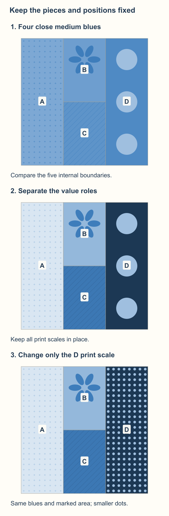
Look at the actual shared boundaries rather than asking whether every swatch differs equally from every other swatch. There are five internal pairs to inspect: A-B, A-C, B-D, C-D and B-C. A and D do not touch inside this block.
A photograph in black and white can help with the light/dark decision. Our grayscale value guide explains that separate process. Here, keep looking at the printed marks too: removing hue does not remove the print.
If you prefer the soft first block, keep it deliberately. For the flower-led example, we'd start with the second block's wider range and continue to the scale comparison.
Compare large and small marks at the same coverage
Now change only D. Keep its navy ground, pale blue marks and four-inch-wide rail, along with every other fabric.
The large-print option has 2-inch-diameter disks centered in repeating 4 x 4-inch tiles. The fine-print option has 1/4-inch-diameter disks in 1/2 x 1/2-inch tiles. The dots become smaller and more frequent together.
Both versions put the same fraction of pale marks on the navy. Our 4 x 12-inch rail holds whole tiles in either version:
| D option | Disk diameter | Disks in the rail | Pale marked area |
|---|---|---|---|
| Large disks | 2 inches | 3 | 3 x pi square inches |
| Mini dots | 1/4 inch | 192 | 3 x pi square inches |
Each large disk has radius one inch, so three disks cover 3 x pi, about 9.42 square inches. Each mini dot has radius 1/8 inch. Its area is pi x (1/8) x (1/8); multiplying by 192 gives the same 3 x pi.
Divide that by the rail's 48 square inches and both have about 19.6% pale marks. This comparison hasn't made D quieter by simply removing most of its pale color. It has changed the scale at which that color appears.
In the drawing, the large disks read as three separate motifs beside the flower. The mini dots read more as repeated texture. For our goal of featuring B, we'd choose the mini-dot D. Choose the large disks if you want them to share the attention.
Stonemountain & Daughter's fabric-selection lesson includes a single-hue print pull and variations in motif scale. Carry that idea into your own pattern: inspect the size and spacing of the marks, as well as the fabric's overall color.
Check the selected prints across six blocks
Repeat the final four-print block two across and three down, with every block facing the same way. The finished study measures 24 x 36 inches before borders.
Each block has two long rails and two center windows. Six blocks need six pieces from each role, or 24 pieces altogether. Equal piece counts still give unequal finished areas:
| Role | Finished piece | Pieces | Total finished area |
|---|---|---|---|
| A, pale rail | 4 x 12 inches | 6 | 288 square inches |
| B, flower | 4 x 6 inches | 6 | 144 square inches |
| C, quiet center | 4 x 6 inches | 6 | 144 square inches |
| D, dark rail | 4 x 12 inches | 6 | 288 square inches |
The total is 288 + 144 + 144 + 288 = 864 square inches, matching 24 x 36. A and D each cover one third of the top. B and C each cover one sixth. Those are finished-area shares, not yardage requirements; construction allowances, cutting layout and repeats affect what you need to obtain.
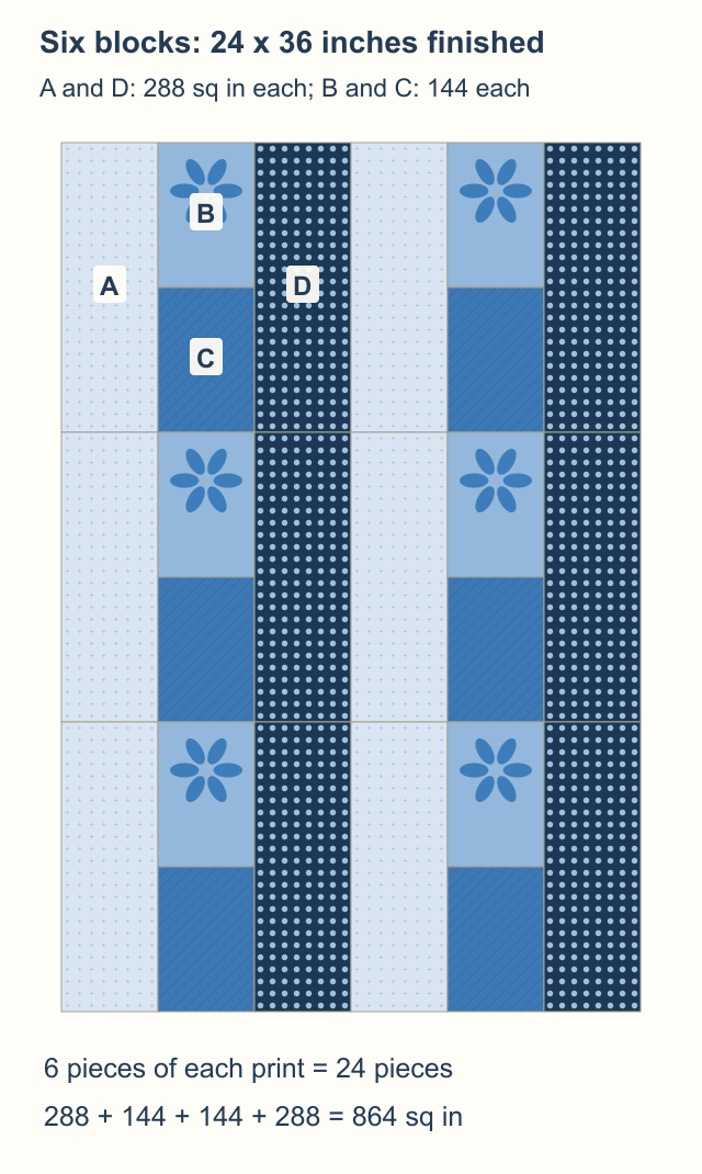
Spread out twice as much A or D as B or C when auditioning the four fabrics. An equal-sized stack hides the stronger influence of the rails.
Then look at the repeat. The rails form vertical bands, and the flowers return at a regular interval. If the dots pull your eye away from those flowers, compare another quiet dark in the same position. Change D before redesigning the whole block.
Make the selection with your own windows
Write the four roles beside your pattern, then fold or mask each candidate to its finished piece size. Check more than one part of a print, especially when the motif spacing is large.
Keep three questions on the table:
- Does this fabric stay within the hue brief you chose?
- Does its value separate or blend where the design needs it to?
- Do its marks support the focal print at the size and amount that will show?
Our color-theory overview covers the wider terms, and the large-print guide helps when preserving a particular motif becomes the main question.
Choose four candidates, lay them in their actual positions, and replace only the one whose job remains unclear. Once the pull works at block and repeat scale, follow your pattern to sew a sample before preparing the rest.
Related posts
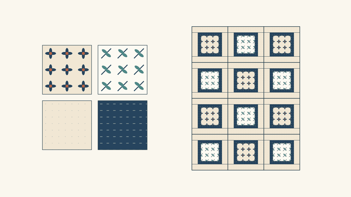
Mixing Fabric Collections for Quilts? Give Each Print a Job
Choose an anchor print, keep useful pieces from two collections, and repeat a bridge fabric. A four-role worksheet shows what to leave out.
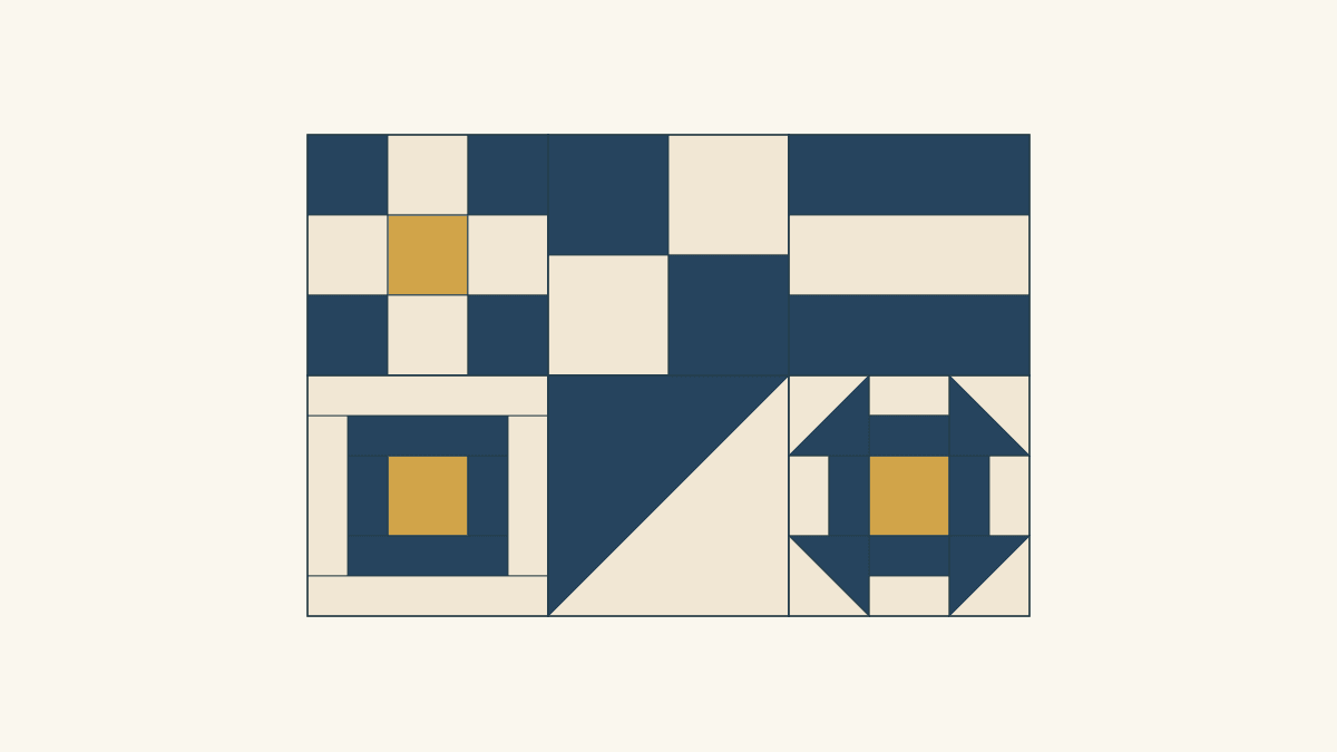
How to Plan Sampler Quilt Fabric Placement
Connect six different blocks by repeating one fabric's role. Compare two placement maps, their fabric areas and the seams between blocks.
Freezer Paper Foundation Paper Piecing or Sew-Through?
Compare sewing through a foundation with sewing beside folded freezer paper, using one simple unit and a realistic plan for sixteen repeats.