


Choose Quilting Thread Color to Blend or Stand Out
Choose quilting thread color by deciding whether the fabric or the stitched line should lead. For a quiet effect, start with a thread close in color and value to the fabric you most want to leave undisturbed. For visible quilting, audition a contrasting color. Check both the lightest and darkest fabrics before settling on one spool.
A useful first comparison holds the quilting design still and changes only the color. You can then see which parts of the top each candidate emphasizes, before thread thickness, sheen and the actual stitches enter the decision.
Give the thread a job
Name the result you want in plain words: "Let the patchwork lead," "Show the curves in the background," or "Make the quilting a second drawing across the top."
In How to Design with Thread at WeAllSew, quilting teacher Lori Kennedy starts with the quilting goal. She explains how similar thread and fabric colors and values help a line blend, while contrast makes it more noticeable. Weight and sheen also affect the result.
The important word is where. A cream thread may be quiet on a cream background and strong across a navy star. Decide which area deserves the quieter treatment. Choosing against only the largest fabric can miss a small focal patch that matters more to you.
Write a preference before shopping: "Blend through the pale background; accept visible lines across the dark leaves." That gives you a clear comparison even when no single color blends everywhere.
Compare the same four lines in three colors
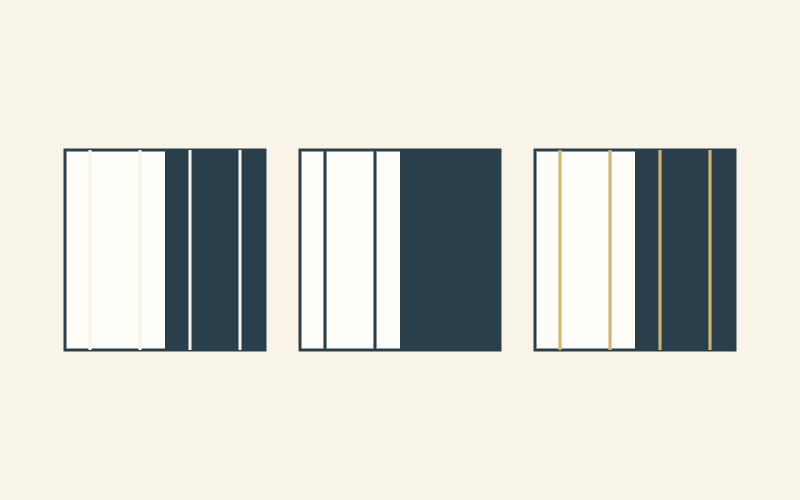
Our drawings use three identical 8-by-8-inch squares. Each square has a light left half and a dark right half, each 4 by 8 inches. Four vertical paths sit 1, 3, 5 and 7 inches from the left edge.
Each path is 8 inches long, so every drawing contains 4 x 8 = 32 inches of drawn line. Two paths lie on each background. The pale, dark and gold versions keep the paths, backgrounds and line width fixed.
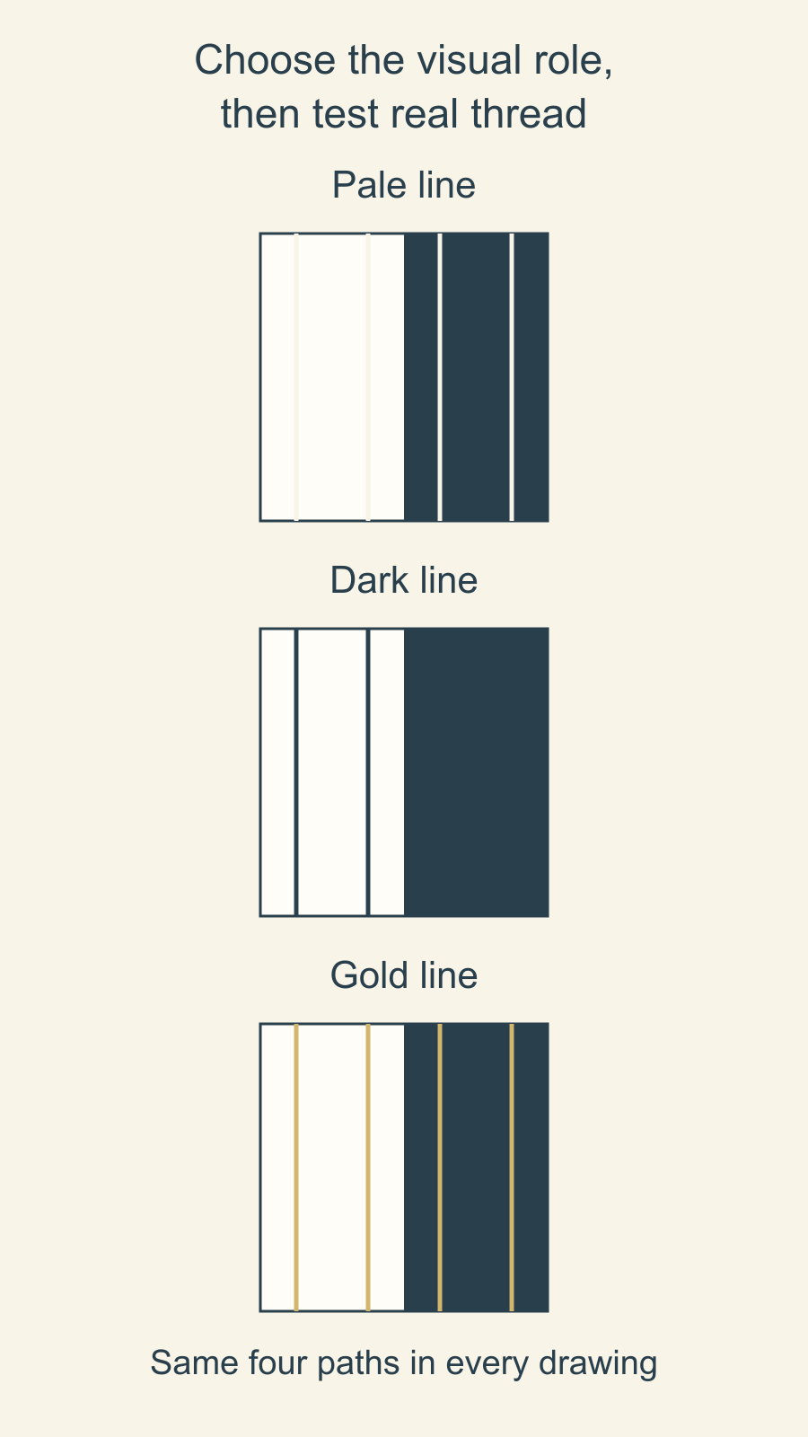
The pale lines merge with the light half and remain visible on the dark half. The dark version reverses that emphasis. Gold introduces another color, with a different relationship to each background.
That gives you three different priorities from one layout. If you want the light field to remain quiet, begin by auditioning the pale candidate. If the dark field should stay uninterrupted, begin with the dark one. If the quilting should connect both fields visibly, try a third color and judge its contrast on both.
Use this comparison to narrow choices. It does not estimate thread consumption: the drawing omits stitch formation, bobbin thread, starts, stops and other allowances. Its equal line lengths simply keep the comparison fair.
Audition actual thread across the important fabrics
Pull out enough thread to see it against the cloth rather than judging only the wound spool. Move the same candidate across the palest fabric, darkest fabric, busiest print and focal area. Keep those fabrics together so you can compare the whole group.
Begin with two or three candidates in the same thread range and size. This keeps the first question manageable: which color supports your intended emphasis? Add a different finish or thickness after you have a color direction.
Use the room lighting in which you expect to see the quilt, and look from more than one angle. A printed fabric may contain several values within one patch, so the thread can disappear in one part and reappear in another. Notice that changing relationship rather than giving the whole patch a single color label.
If you struggle to separate hue from lightness, our grayscale value check explains how a photograph can help you compare the fabrics. Return to the actual thread and cloth for the final audition, especially when sheen matters.
Keep short notes such as "quiet on cream; clearly visible on navy." They are easier to act on than "nice neutral." A gray, beige or medium-value thread can be a useful candidate, but its name alone does not promise it will blend across every fabric.
Read the full thread description
After shortlisting colors, compare the actual products. Fiber, ply and finish add information that a color name and weight number leave out.
These examples show why the specific thread line matters:
| Thread line | Maker's size and ply | Fiber | Maker-described visual quality or use |
|---|---|---|---|
| Aurifil Cotton 40wt | 40wt, 2-ply | 100% cotton | More defined topstitching or quilting |
| Aurifil Cotton 50wt | 50wt, 2-ply | Cotton | Subtle quilting among its listed uses |
| Superior So Fine! 50wt | 50wt, 3-ply | Polyester | Matte finish |
| Superior Magnifico 40wt | 40wt, 2-ply | Trilobal polyester | High sheen |
Aurifil describes its Cotton 40wt as an option when more definition is wanted, while its Cotton 50wt includes subtle quilting in its uses. Those descriptions help you choose candidates within the named range.
The two Superior examples show why fiber alone does not tell you the finish: the maker describes So Fine! 50wt as matte and Magnifico 40wt as high sheen. Both are polyester.
Superior's thread-measurement explanation also describes inconsistent weight labeling and the importance of ply and construction. Do not treat 40wt and 50wt as a universal cross-brand diameter scale, or calculate a percentage change in thickness from those numbers. Compare the exact products and their stitched appearance.
Make a small sample that answers one question
Kennedy recommends stitching thread samples on the fabrics in the quilt. Make the sample useful by including the actual top fabrics, intended batting and backing, with enough room for the motif you want to compare.
For a color comparison, repeat the same small motif for each candidate. Keep the thread line and size the same where possible. If you change the product as well as the color, label both changes so you know what you are comparing.
Use the machine and thread makers' guidance for a suitable setup. This visual comparison does not establish needle, tension or machine compatibility. If someone else will quilt the project, discuss samples from their available threads instead of assuming they can use any spool you choose.
Look at the front and back, then step back to your usual viewing position. Ask whether the quilting supports the patchwork, whether a bright line crosses a focal detail, and whether you like the effect where the background changes.
| Candidate | What to record | Decision after stitching |
|---|---|---|
| A | Exact product and color number; light and dark fabric observations | Record here |
| B | Exact product and color number; same motif and materials | Record here |
| C, if needed | What changed from A or B, including finish or size | Record here |
Date and label the physical samples so you can return to the exact choice. Keep the observation separate from the preference: "The line is obvious on the cream" describes what you saw; "I want that outline" records why you chose it.
Keep color and path decisions separate
A visible line can come from contrasting color, a prominent path, or both. Our stitch-in-the-ditch and echo comparison examines where the stitches sit. Settle that question separately rather than changing the path every time you try a new thread.
If you are using a longarm service, carry your labeled sample or exact color preference into the longarm design brief. The brief helps confirm the agreed work; your audition explains what you mean by subtle or visible.
Choose the fabric area that should lead, pull two candidate colors from one suitable thread range, and compare them across the whole fabric group. Then stitch the same small motif in each. Keep the sample that best answers your visual goal beside the quilt while you finish the plan.
Plan your next quilt
Lay out blocks and try colors in QuiltLab's grid editor before you cut.
Free forever, no card needed.
Get quilting tips by email
QuiltLab updates, tips and quilting inspiration. Unsubscribe anytime.
Related posts
Monochromatic Quilts: Choose Prints That Stand Apart
Choose four blue prints by their jobs, then compare value and print scale separately. An equal-coverage dot swap shows why both matter.
Mixing Fabric Collections for Quilts? Give Each Print a Job
Choose an anchor print, keep useful pieces from two collections, and repeat a bridge fabric. A four-role worksheet shows what to leave out.
How to Plan Sampler Quilt Fabric Placement
Connect six different blocks by repeating one fabric's role. Compare two placement maps, their fabric areas and the seams between blocks.