


Low Volume Quilt Fabric: When Do Quiet Prints Need Contrast?
Low volume quilt fabric is any light print: a white or cream ground with small, quiet marks that reads pale from across the room. The description of Cheryl Arkison's CreativeLive class on low-volume fabrics puts it simply: in the quilting community, low-volume "is synonymous with light, printed fabrics." These prints need different values only where a shape meets the background. Everywhere else, let them blend. If some of your lights form the shapes, those prints need one clear step in value from the background prints.
Sort your lights into two groups before you cut: a lighter field group and a darker shape group. Set aside anything that falls between them. Then test the darkest field print against the lightest shape print at finished size. Below, a 45 x 60 inch plus quilt shows the whole plan with counts. We drew these diagrams for this article and haven't sewn them.
If you're choosing one background fabric for colored blocks, start with our guide to choosing quilt background fabric instead. This article is about a quilt where several quiet prints share the work.
What makes one light print read darker than another
Value is relative. The Quilt Show's Quiltipedia defines it as "the relative lightness or darkness of fabric" and says value is set by the lightest and darkest fabric in a selection. In an all-light pull, your darkest light print plays the part of the dark.
Three things move a light print up or down:
- Ground color. White reads lighter than cream, and cream reads lighter than tan or pale gray.
- How much of the ground the marks cover. Close dots, dense text and tight lines darken a print even when each mark is small.
- Mark color. Navy or black marks pull a print down more than tan or pale yellow marks of the same size.
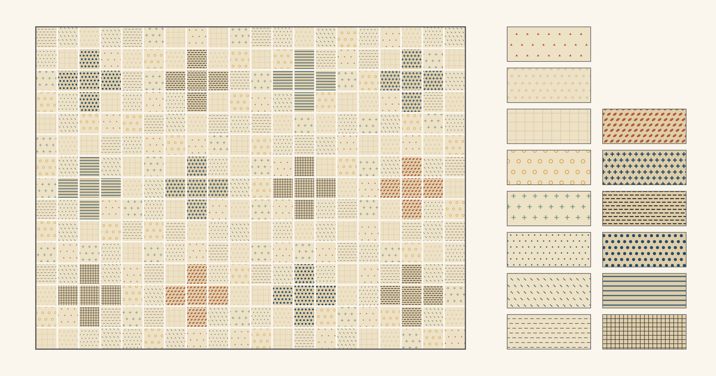
From a distance, your eye blends the ground and the marks into one tone. In the sorted swatches below, the field prints sit on a cream ground with marks covering about 2 to 15 percent of the surface. The shape prints sit on a darker tan ground with marks covering about 19 to 25 percent.
Scale and texture help as well. Arkison's class teaches how to "achieve contrast through scale and texture." In this plan the shape prints also have closer, bolder marks than the field prints, so a plus differs from the field in texture as well as value.
When quiet prints can blend, and when they can't
Look at each seam by what sits on either side of it:
- Field next to field: let them blend. Shayla Wolf of Sassafras Lane Designs describes low-volume prints as "white and cream fabrics with subtle prints on them that read as one from afar." Her check is to lay them out, step back and squint. If none stands out, they work as a scrappy background.
- Shape next to shape: these should blend too, so the shape reads as one piece. The easiest way is to cut each shape from one print.
- Shape next to field: this is the seam that draws the design. It's the only place two quiet prints must clearly differ.
So you don't need every print in the pile to differ from every other. Find the seams that outline your shapes, and put the value difference there.
Sort the pile into field, shape and set aside
- Pull every light print you might use. Fold each one so a window the size of your smallest finished piece shows, 3 inches in the example below.
- Line them up from lightest to darkest. Step back, or take a photo with the camera set to black and white, as The Quilt Show suggests.
- Split the line where the step between neighbors is biggest. The lighter run is your field group; the darker run is your shape group.
- Set aside prints that fall between the groups, and white or cream grounds with a few large dark marks. Rachel Hauser of Stitched in Color warns that "prints with white backgrounds and dark elements will probably be hard to place", and suggests starting with fabrics that clearly fall into one camp.
- Squint at the field group on its own. Move any print that jumps forward to the set-aside pile.
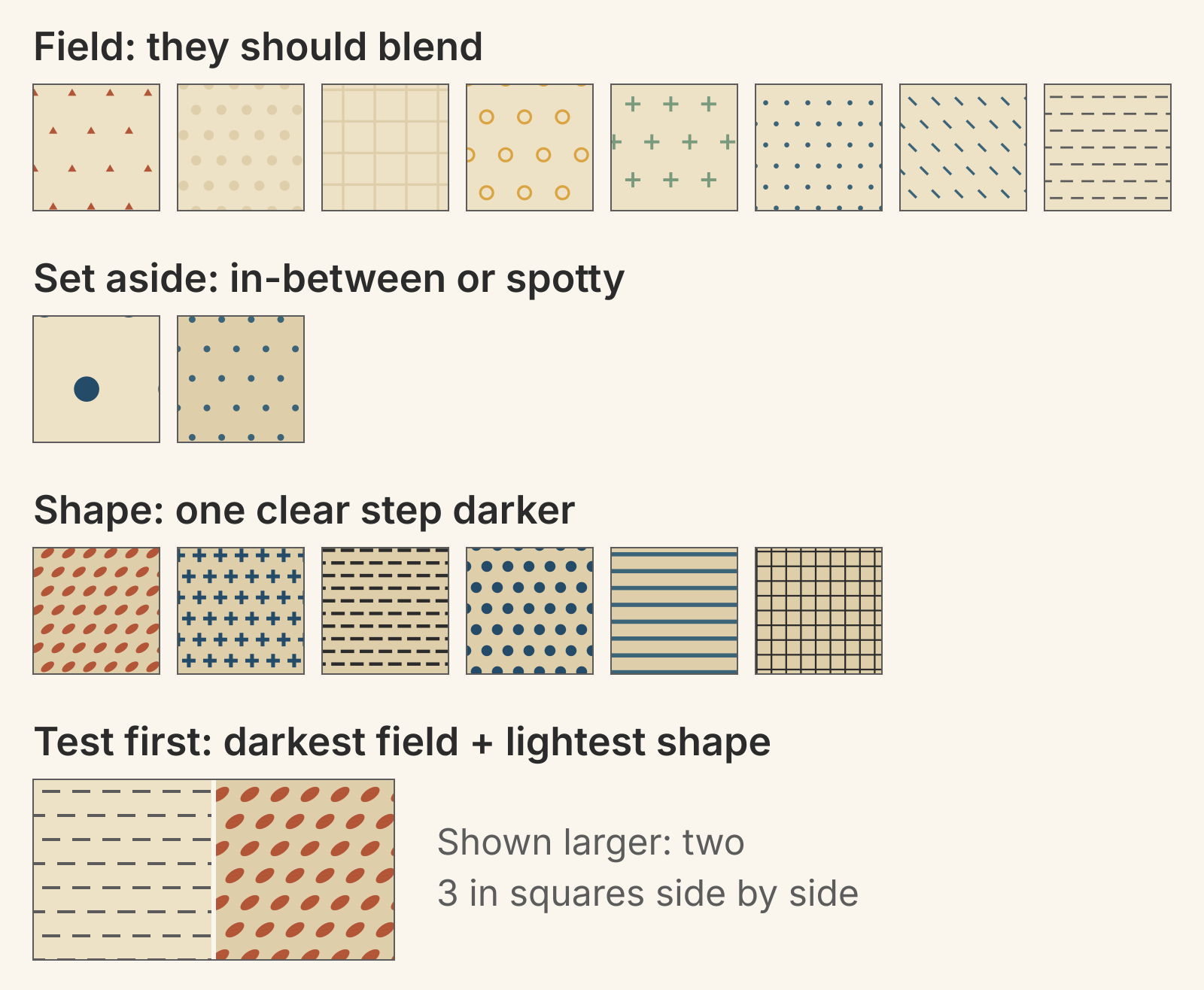
The navy-spot print shows why spotty prints go in the set-aside pile. Averaged over a yard, it's as light as the darkest field print. But its spots sit about 2 inches apart, so a 3 inch square holds anywhere from one to three whole spots. Across the field, one square would show a lone spot and another a cluster. Save a print like that for larger pieces or another quilt.
Test the weakest pair first
Once the groups are sorted by value, the pair with the least contrast is always the darkest field print next to the lightest shape print. If that seam shows, every other shape-to-field seam has at least as much value contrast.
Place a 3 inch piece of each side by side and look from across the room, or photograph them in black and white. If you can still see where one stops and the other starts, your two groups work. If the line disappears, move the lightest shape print to the set-aside pile, or swap in a darker one, and test the new weakest pair.
Worked example: a 45 x 60 inch low-volume plus quilt
Each block is a grid of 5 x 5 squares that finish at 3 inches. With 1/4 inch seams, cut the squares at 3 1/2 inches. The block finishes at 15 inches and measures 15 1/2 inches unfinished.
The plus is the center square and its four neighbors, so each block has 5 shape squares and 20 field squares. A plus spans 9 inches. The field ring around it is 3 inches wide, so neighboring pluses sit 6 inches apart, arm tip to arm tip.
Set 12 blocks 3 across and 4 down. The top finishes at 45 x 60 inches and measures 45 1/2 x 60 1/2 inches before the outer seam allowances are sewn into the binding.
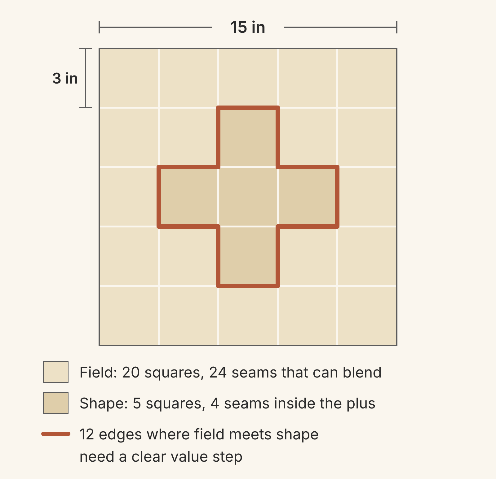
Here's the seam tally for the whole top. Each seam counted is one 3 inch edge between two squares:
| Seam between | Per block | Whole top | What the two prints need |
|---|---|---|---|
| Field and field | 24 | 373 | Close values, so they blend |
| Plus and plus | 4 | 48 | The same print |
| Plus and field | 12 | 144 | A clear value step |
| Total | 40 | 565 |
The whole-top field count includes the 85 seams where blocks join, since every block edge is field. Only 144 of the 565 seams, about a quarter, need the step. Each plus has 36 inches of outline to check.
The plan pulls 16 prints and uses 14 of them:
| Group | Prints | Squares from each | Total squares |
|---|---|---|---|
| Field | 8 | 30 | 240 |
| Shape | 6 | 10 (two pluses) | 60 |
| Set aside | 2 | 0 | 0 |
| Total | 16 | 300 |
The field is 240 of 300 squares, or 80 percent of the top. Audition it at that proportion, with far more field than shape on the table. These are design counts of 3 1/2 inch squares with no spares; cut a few extra of each print for a test block and miscuts.
Spread the prints across the top
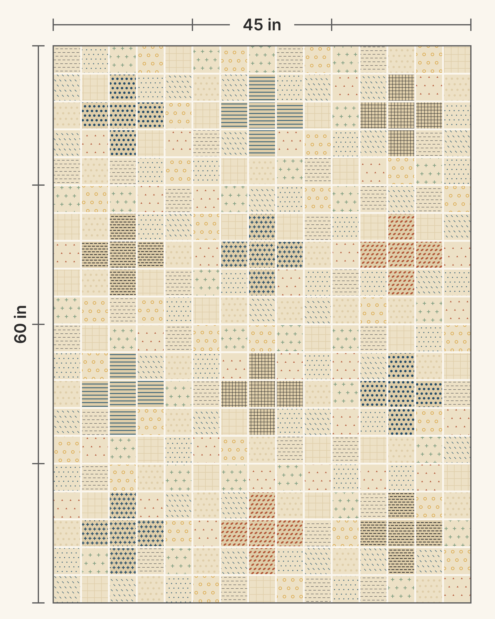
The full plan below places every square using three rules:
- One shape print per plus. Each plus reads as one shape. Each shape print makes two pluses, in blocks that don't touch, even at a corner.
- No matching field squares side by side. No two squares of the same field print share a seam. In this plan they don't touch at corners either.
- No clumps. No block holds more than 3 squares of any one field print.
Lay out the shape squares first, then fill the field. If one field print starts to collect in one area, break up the clump by swapping squares, as in our scrappy quilt placement plan.
You can mix prints inside one plus if those prints are close to each other in value. Then the 4 seams inside each plus become seams to check for blending.
Want a little color? Arkison's class also covers adding "a little pop of color." Give the color its own job, such as the center square of a few pluses, and check its seams the same way.
Fixes when the plan doesn't read
| Problem | Likely cause | Fix |
|---|---|---|
| Pluses fade from a distance | The weakest pair is too close in value | Retest it and replace the lightest shape print |
| The field looks patchy | One field print is darker or has dark marks | Squint at the field group and set that print aside |
| One plus jumps forward | Its print is darker than the other shapes | Swap in a closer shape print, or keep it as a focal point |
| A stripe or clump in the field | One print repeats nearby | Swap two field squares of different prints |
For the wider picture of value, saturation and print scale, see Color Theory for Quilters.
Try the plan before cutting
Photograph each print straight on, in even light. In the Swatch Editor, open it with File > Upload Image, crop it and check its dimensions so the marks appear at their real scale. Choose Save and name it; the Swatch Editor guide covers each step.
Then draw the 15 inch block in the Block Editor as 25 squares of 3 inches. Select the five plus pieces and change their fabric, then spread your field prints across the other 20. Swap shape prints one at a time against the same field, starting with your weakest pair.
QuiltLab has no grayscale view, so do the black-and-white check with your phone. Screen color won't match dyed cloth exactly, so confirm your finalists against the fabric itself. QuiltLab also doesn't make cutting lists; keep the 240 and 60 square tally yourself.
Assign fabrics in the Block Editor →Select pieces and change their fabric to compare printsYour next step: pull your lights, line them up, and test the weakest pair. If the seam shows from across the room, cut the shape squares first and lay out one block before you cut the field.
Related posts
Grayscale Value Check: Which Quilt Fabrics Will Blend?
Photograph your fabrics in black and white and look for any two that turn the same gray. A worked Friendship Star shows why opposite colors can blend.
Irish Chain Quilt Colors: Which Fabric Goes Where?
Most Irish Chains put darker chain fabrics on a light background. Compare single and double chain value maps and see which fabric shapes the diamonds.
Ohio Star Quilt Block Variations: Will the Star or Center Stand Out?
Many Ohio Star variations keep the same nine-patch and move the fabrics. Compare four color maps on one 12-inch star and see why value decides what you notice first.