How to Size Applique Letters on a Quilt

Size applique letters on a quilt as a complete word, including the gaps, before preparing individual characters. For a first project, choose broad, simple letters in fabric that stands out from the background. Then check the narrowest strokes and openings at finished size. A word can fit across the quilt while its smallest details are still awkward to cut or stitch.
There is no single letter height that suits every name, quilt and edge method. Work from the space available and test the hardest detail in the actual materials before preparing every character.
Choose the message and viewing direction
Write the exact word or name, including capitalization and punctuation. Decide which edge of the quilt is its top and how the quilt will usually be viewed.
A short word on a hanging quilt has a different job from small lettering tucked into a corner. Lay out the whole word before decorating individual letters. That keeps a favorite ornate initial from taking the space needed by the remaining characters.
Geta Grama's lettering lesson favors bold readable forms and explains reference-based placement. Melissa at Sew Like My Mom also discusses why thin forms can be harder to cut, handle and stitch.
Neither supplies a universal minimum stroke width for every fabric and applique method. Use their advice to simplify your first choice, then test your own smallest detail.
Try the letter fabric against the actual background before choosing the final size. Geta recommends contrasting fabrics and solids or small-scale prints so the message stands out. A large print can make one part of a letter disappear into the background even when its outline is simple. View the whole word from the distance at which you expect it to be read.
Fit the word before enlarging one letter
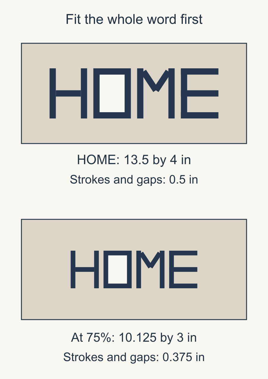
Our drawn word is HOME, using manually drawn geometric letters rather than a copied font. Each letter occupies a 3 by 4-inch box. Three half-inch gaps separate the four letters.
For any word, add the finished width of every letter and the gaps between neighboring letters. Four letters need three gaps; there is no extra gap after the final letter. If the characters have different widths, add their actual widths instead of multiplying by the widest one.
The full width is:
4 times 3 inches + 3 times 0.5 inch = 13.5 inches.
On an 18 by 8-inch field, centering that word leaves 2.25 inches at each side and 2 inches above and below.
| Part | Planned size | Quantity |
|---|---|---|
| Letter box | 3 by 4 in | 4 |
| Inter-letter gap | 1/2 in | 3 |
| Complete word | 13.5 by 4 in | 1 |
Those are visible design dimensions. Your edge preparation determines what is traced or cut outside them. Keep that preparation separate from the composition measurements.
Inspect strokes and openings together
In the larger drawing, the letter strokes are half an inch wide. That still leaves interior openings that make O and the spaces within M recognizable.
Now reduce the lettering and its gaps to 75%, keeping the background field at 18 by 8 inches. The word becomes 10.125 inches wide and 3 inches high. Both the stroke width and the gaps shrink to 0.375 inch, or 3/8 inch. The extra background space doesn't restore the detail lost within the smaller letters.
The smaller word may fit a narrower field, but fitting is only the first question. Look at the inner spaces, sharp changes in direction and the route the needle would follow. A letter with several tight turns can ask more of your method than a straight-sided letter of the same height.
If the smallest detail is unsuitable, revise the form or choose a larger word. Adding space around a thin stroke does not make the stroke itself easier to prepare.
Use optical spacing after the measurement
Equal gaps are a useful first draft. They do not always look equal because letters have different silhouettes.
A straight vertical edge beside another straight edge can feel closer than a sloping edge beside an open corner. Move paper letters slightly while keeping the whole word centered in its field. Compare from the intended viewing distance.
Keep a measured baseline and a top reference while making those adjustments. Otherwise, fixing the space between H and O can quietly move O lower than the other letters.
Photograph the chosen arrangement with a ruler or written reference beside it. Record the final gaps instead of relying on the initial equal-gap table after you have changed them.
Check the required reversal once
The correct front view is the version you want to read on the quilt. Whether the tracing must be reversed depends on the preparation method and which side of the fabric receives the traced shape.
Our applique mirroring guide explains that decision. Use an asymmetric letter or a small paper word as the check; a symmetrical H will not reveal an accidental reversal as clearly as the whole word will.
Geta's lesson discusses reversing for wrong-side fusible preparation. Apply that advice within the method she describes, and follow the exact fusible product's directions for materials, heat and care. Ordinary paper composition pieces do not establish those settings.
Keep the front-view placement guide labeled separately from any reversed cutting or tracing sheet. Two clearly named sheets are easier to manage than one page turned over repeatedly during preparation.
Register the word to the quilt
Mark the finished field's center and the planned baseline on the working layout. If the field will lose fabric into later seams, use its finished boundary when judging the side margins.
Kathy K. Wylie's applique placement guidance uses matching centers and key registration points. For lettering, useful points include the word's center, the baseline and the top of a tall letter.
Set the whole word in place before attaching the first letter. Check spelling, orientation and margins with all the paper forms present. Then use the preparation and attachment method you have verified for the actual materials.
If you print a working sheet, our actual-size template guide explains why printed scale needs its own check. The drawing's stated dimensions do not guarantee that a printer has preserved them.
Test the hardest detail first
Choose the narrowest stroke or tightest inside corner and make a representative sample. Include the intended background, edge preparation, thread and stitch method.
Check whether the opening stays recognizable, the two sides of a narrow stroke remain distinct, and you can turn and stitch the corner as intended. Judge the result after removing any temporary support according to its directions. If the feature needs changing, simplify the letter or enlarge the word before investing in every character. Save the sample with your final size and spacing notes.
Your next step is to cut paper forms for the complete word and place them at finished size. Read it from the intended distance, then prepare and stitch the smallest detail in fabric before making the rest.
Plan your next quilt
Lay out blocks and try colors in QuiltLab's grid editor before you cut.
Free forever, no card needed.
Get quilting tips by email
QuiltLab updates, tips and quilting inspiration. Unsubscribe anytime.
Related posts
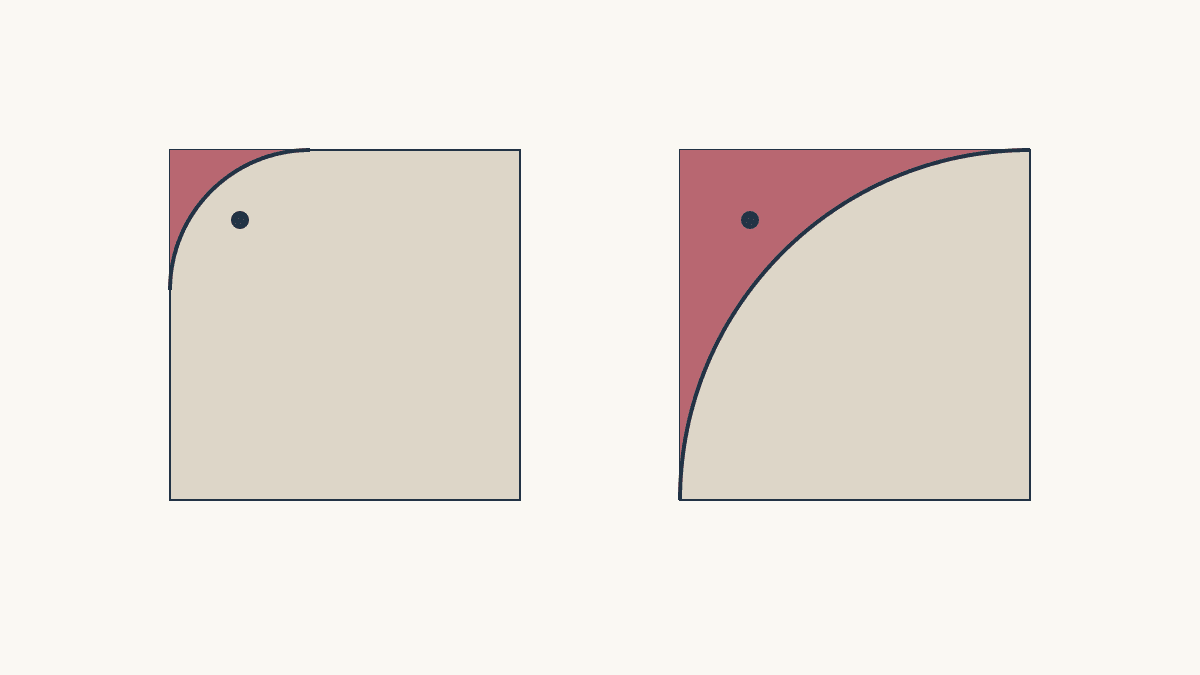
Rounded Quilt Corners: Will Your Motif Survive?
Compare two corner radii against nearby motifs before trimming, then plan a consistent curve and suitable binding method.
Lightweight Quilt Batting: Check Care First
Write the coverlet’s care requirements, check the exact batting limits, and test the finished combination before calling it lightweight.
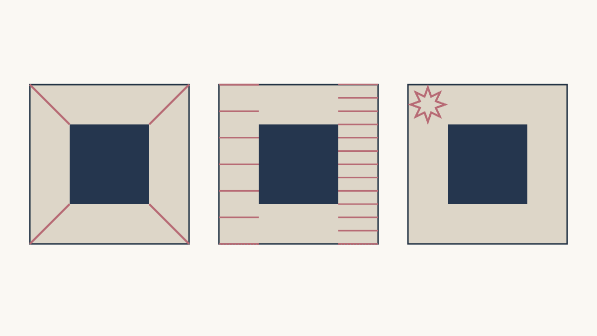
Quilting Negative Space: Extend, Fill or Echo
Compare three quilting approaches on one fixed quilt layout, then count the lines and check the open areas.