How to Change Photo Quilt Background Contrast
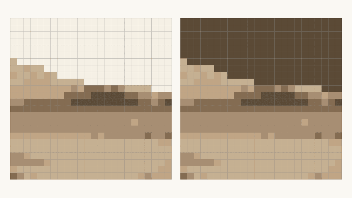
Change a photo quilt's background only after checking whether its color also appears in the subject. Keep the subject's colors and every patch position fixed, then compare a pale and a dark version. For the landscape below, we would keep the pale version: the dark background blurs part of the tree crown.
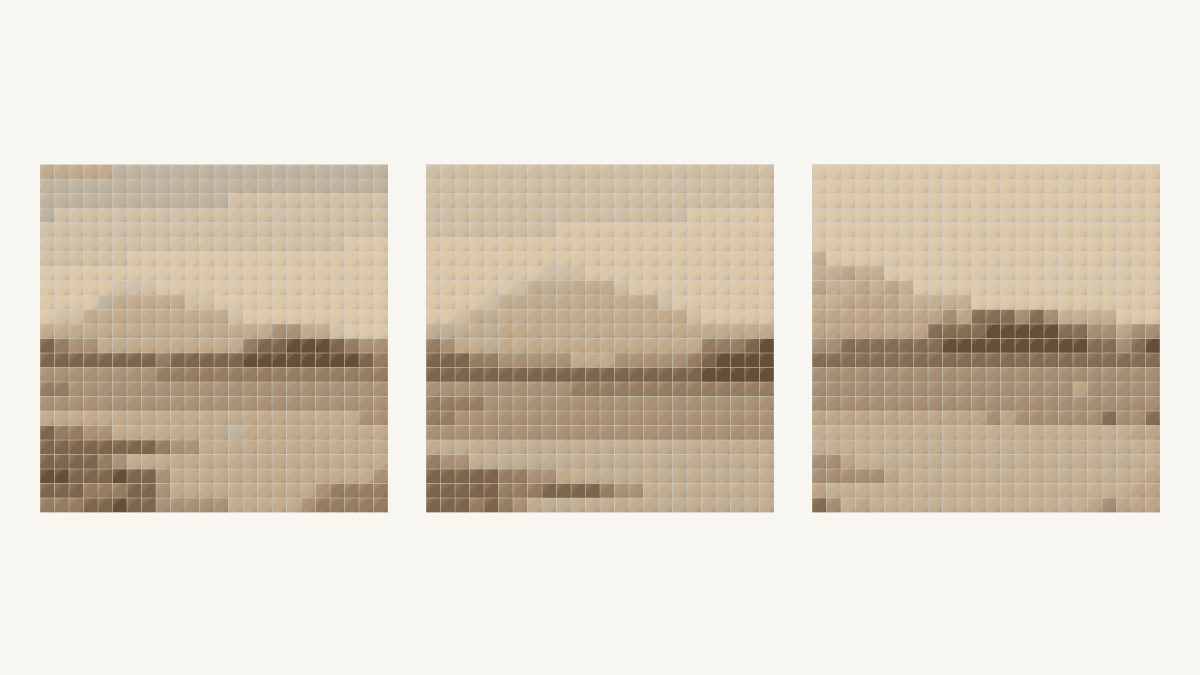
This photo quilt background contrast study changes 219 of 576 square patches. The remaining 357 stay the same. That makes it possible to see what one background choice does without also changing the crop, grid or trees.
Decide what belongs to the subject
Write down what you want the quilt to show before changing a color. A mountain portrait, a river scene and a study of trees can use the same photograph with different priorities.
For this comparison, our subject is the foreground trees, settlement, riverbank and river. The sky and faint distant landform form the background. That choice matters: the color we change includes the distant slope, so this is a broader background edit than recoloring the sky alone.
Susan Carlson asks students what the subject is, where it is and why it matters in her lesson on fabric-collage backgrounds. Those questions help her choose a background that supports the image's story. They also give this digital comparison a clear job: keep the tree group distinct above the river.
Pick your essential edge before auditioning colors. Here, it is the upper tree crown against the pale field. A different scene might depend on a white animal's back or a pale building against a hill.
Check every place the color appears
A detected color is a group of patches, not a named object. One green may occur in leaves, ground and the shadow under a petal. Changing the whole entry changes all of those places.
We first considered a flower result, but its dark green entry included leaves we wanted to keep. We rejected it for this background-only comparison. Calling that green “background” would not make its subject patches disappear.
In the landscape, we checked every patch assigned to Color 1, #DEC9AB, against the source photograph. All 219 belonged to the sky or faint distant landform under our chosen brief. None belonged to the foreground trees, settlement, riverbank or river.
For your own image, follow each candidate color through the whole grid. Look especially at thin outlines and small shadows. If the entry also carries an important subject feature, leave it alone for this experiment. Choose a different background-only entry or another source that lets you separate the roles clearly.
Keep the image and grid fixed
Our source is Landscape with River and Mountain, an unknown photographer's image from the 1870s. The Met describes it as an albumen silver print from a glass negative with applied color. Its public-domain image is available through the museum's CC0 Open Access program.
We used one 1,500-pixel-square crop favoring the trees and river. Its colors belong to that historical image; they are not a record of the scene's modern natural colors.
The October 24, 2026 QuiltLab comparison keeps a 24-by-24-inch field with 1-inch finished square patches. There are 24 x 24 = 576 patches, arranged as one 24-inch block.
We kept Squares, From the photo, Fidelity, Stretch and Maximum colors: 8. Clean up stray patches stayed Off, and Simplify background stayed off. The result actually used six colors. We made two separately named copies of that result and changed only Color 1, without regenerating either image. The Quilt Editor guide introduces the photo-mosaic design mode.
In this October 24 check, the palette changes appeared in Preview block guide and its downloaded PDF, while the main canvas and SVG download kept the detected colors. That is a dated observation, not a claim about every later export. The comparisons below are crops of those actual PDF overviews. Inspect the file you plan to use and keep it with the matching saved design.
Compare the tree edge before the whole mood
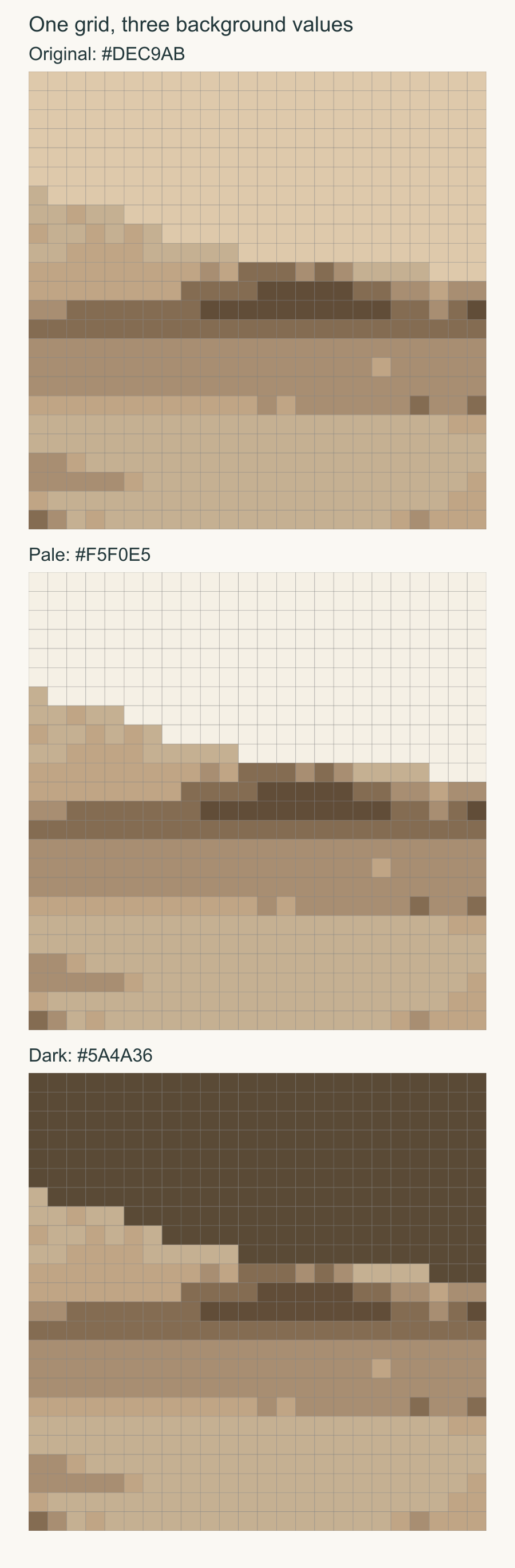
The original background is #DEC9AB. Our pale copy changes it to #F5F0E5; the dark copy changes it to #5A4A36. Each still has six used colors and the same patch counts.
| Version | Background entry | Changed patches | Other patches |
|---|---|---|---|
| Original | #DEC9AB | 0 | 576 unchanged |
| Pale copy | #F5F0E5 | 219 | 357 unchanged |
| Dark copy | #5A4A36 | 219 | 357 unchanged |
The edited group covers 219 / 576, or about 38% of the field. It is large enough to change the picture's overall balance even though the lower portion stays untouched.
In the pale version, the upper tree crown makes a clear dark step against the light background. In the dark version, parts of that edge become harder to separate. The dark field also gives the distant slope more visual weight. Neither edit moves or restores a branch.
Ellen Lindner describes lightening a background locally where a pear or dark seed heads began to merge in Backgrounds by Design. Her examples also include deliberate merging when it serves the story. The useful lesson is to judge the particular neighboring shapes, rather than assume one background value always works.
Look at the same cells close up
The windows below show rows 9 through 14 and columns 10 through 18, counted from the upper left. Each output window has 6 x 9 = 54 cells. The photograph window covers the corresponding source region.
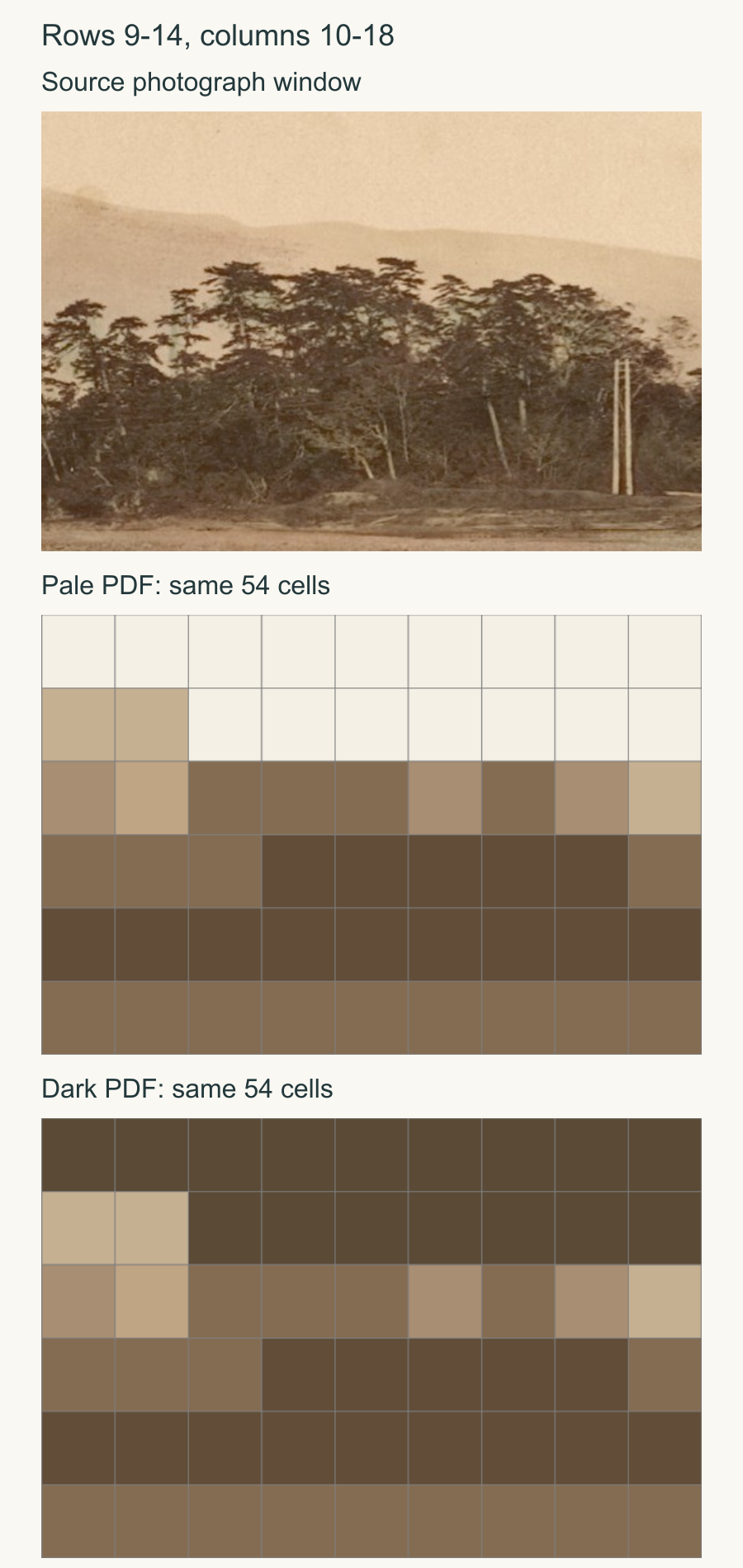
For a precise check, compare row 10, column 12, with row 11, column 12 immediately below it. The upper background cell changes between versions. The lower tree cell stays #846C52. The same relationship repeats at columns 13 and 14.
That little boundary explains more than the palette chips alone. The pale fill makes the dark tree cells easier to follow. The dark fill comes closer to their value and weakens that separation. Look at the actual image again after reading the cell positions; knowing where a tree belongs can make you imagine an edge that has become unclear.
The American Patchwork & Quilting editors' contrast lesson emphasizes that contrast depends on neighboring values. Their fabric examples support checking the combination. A pleasing background chip by itself cannot tell you whether this tree edge will remain visible.
Keep the chosen copy with its guide
In Palette, change one verified background-only entry at a time. Open Preview block guide and check its color key before exporting. Confirm the new color appears there, along with the expected count. Keep the generation settings fixed during this comparison: changing color source, cleanup or analysis quality clears the mosaic and palette edits, as the photo-mosaic controls guide explains.
Then save the copy, wait for Saved, reopen the same named design and export a fresh guide. We checked both complete two-page guides again after reopening. The pale and dark overrides remained, every target cell matched its chosen color, and all 357 other cells kept their original fills. The original design remained unchanged too. The saving guide explains the save states.
Once you choose the digital relationship, put real fabric candidates beside the subject fabrics in the same light. Our background-fabric guide covers that physical audition. Screen colors cannot choose an exact dyed cloth for you.
Name the subject edge you need, check every cell sharing its background color, and keep one pale and one dark copy for comparison. Choose the version that serves that edge, then keep its matching saved design and complete guide together before choosing cloth.
Free patterns to try
Printable PDF patterns with cutting charts and diagrams, free to download.
Family Photo Quilt
Quilt patternBeginner · 54 x 62 in lap quilt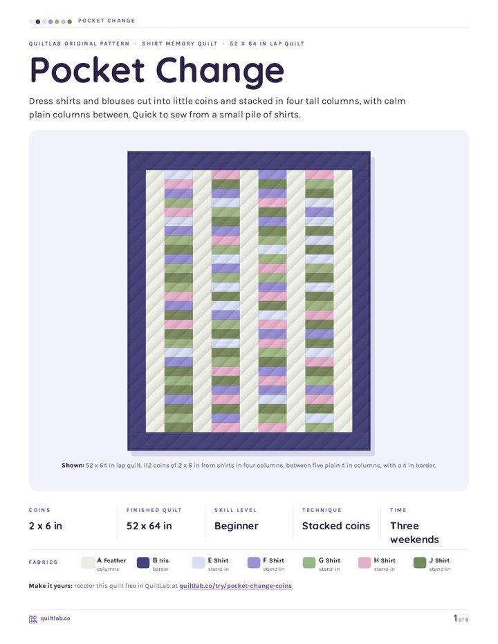
Pocket Change
Quilt patternBeginner · 52 x 64 in lap quilt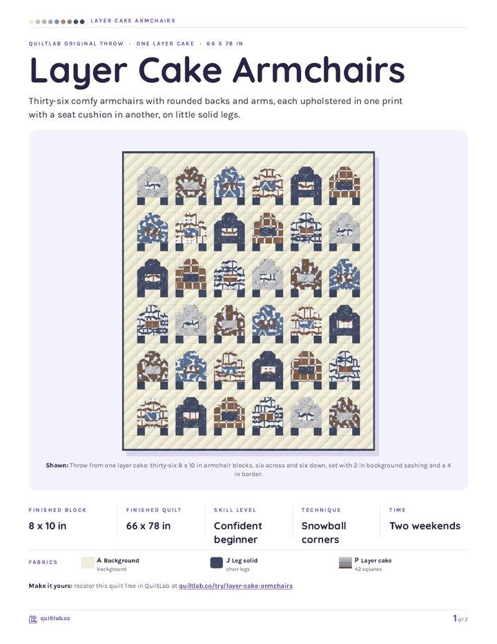
Layer Cake Armchairs
Quilt patternBeginner · 66 x 78 in throw
Plan your next quilt
Lay out blocks and try colors in QuiltLab's grid editor before you cut.
Free forever, no card needed.
Explore photo quilt designGet quilting tips by email
QuiltLab updates, tips and quilting inspiration. Unsubscribe anytime.
Related posts
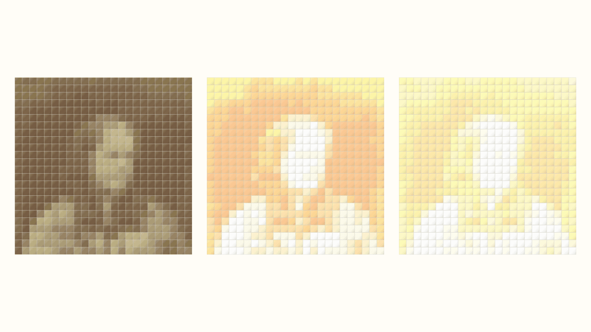
Photo Quilt Contrast: Keep Useful Detail
Compare three source-photo adjustments at one quilt grid. See where highlights disappear and check the applied image before choosing a mosaic.
Plan a Printed Photo Memory Quilt Layout
Give one photo room to lead, add separate captions and compare two measured drawings using provider-listed panel sizes.
Keep the Main Shapes in a Landscape Photo Quilt
Compare three landscape crops at 576 patches. See which river and tree shapes remain, and separate a cropped-out summit from a faint reduced outline.