Photo Quilt Contrast: Keep Useful Detail
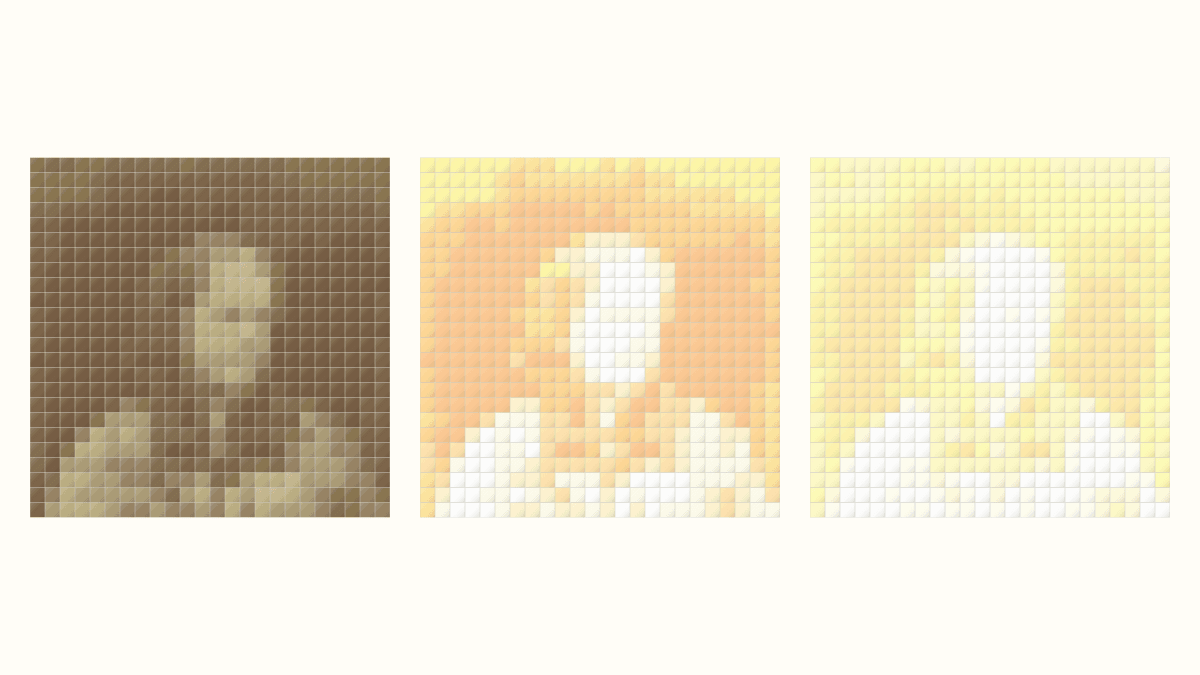
Keep the unedited photo, adjust a copy and compare both at one fixed quilt grid. Accept the edit when the edges you need become clearer and useful highlights still show differences. If a face or pale petal turns into a blank light area, return to the source before cutting fabric.
A higher slider number can make a picture look brighter while removing the shading that described the subject. In the portrait comparison below, we would keep the neutral source over either adjusted version.
Choose the light and dark areas you need
Look at the photograph before changing a control. Pick two or three boundaries that carry its character: hair against a forehead, a pale cheek against the side of a nose, or a light sleeve against a darker body.
The American Quilter's Society reference-photo guide recommends inspecting highlights and shadows when choosing pictorial-quilt photographs. It also suggests a black-and-white view to examine contrast and overexposure. The aim is useful separation in the picture you intend to interpret.
For our portrait, the forehead, facial shading and patterned clothing all matter. We want the light areas to remain different from one another. Making them equally pale would erase part of the reference before a mosaic had a chance to describe it.
Keep the original beside your working copy. Terry Aske's portrait-pattern tutorial recommends starting from a copy, saving versions and adjusting for a useful range of values. Her applique process uses different tools from these square mosaics; the version-saving habit makes either comparison easier to judge.
Compare one source at fixed conversion settings
On October 24, 2026, we compared QuiltLab Fabric Editor Contrast 0, 20 and 60, with Brightness 0 throughout. Each case started from a separate copy of the same saved quilt and the same 2,400-by-2,400-pixel source crop.
The photograph is Julia Margaret Cameron, photographed by Henry Herschel Hay Cameron in 1870. The Met identifies this albumen silver print as Public Domain; its Open Access policy provides public-domain collection images under CC0.
Every mosaic kept a 24-by-24-inch field, one 24-inch block, and 1-inch finished square patches. That gives 24 x 24 = 576 patches. We also kept From the photo, Fidelity, Stretch and Maximum colors: 8. Clean up stray patches stayed Off, and Simplify background stayed off.
These are the Fabric Editor control's own numeric values from that dated comparison, rather than a preset for another photograph. We did not perform an external Levels adjustment or treat the numbers as percentages. The Fabric Editor guide shows the image-preparation controls.
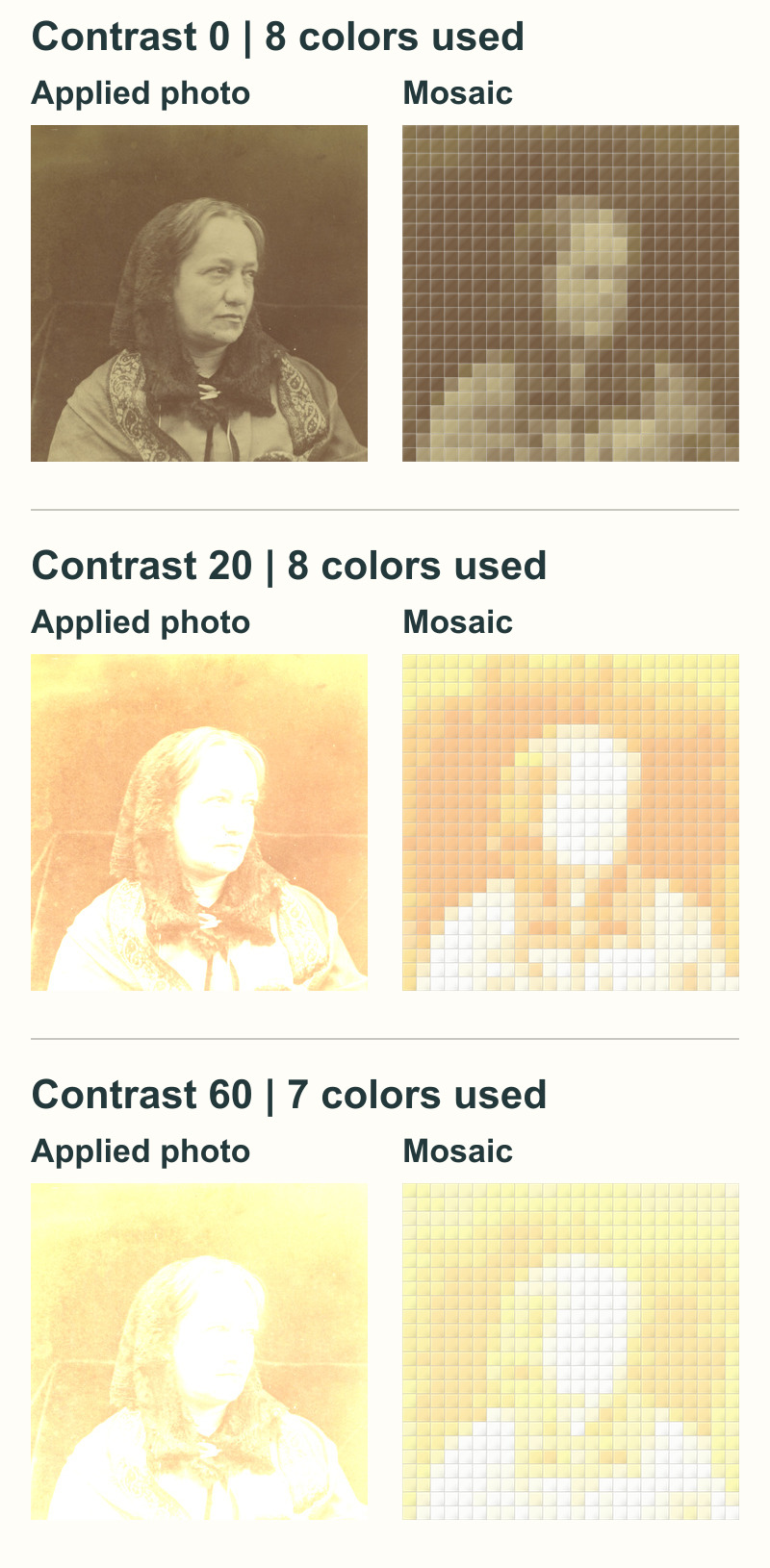
Read the source before judging the mosaic
At Contrast 0, the photo retains shading across the face and separate light and dark marks in the clothing. The mosaic already simplifies those details into larger areas. Its broad head and shoulders remain more apparent than its expression.
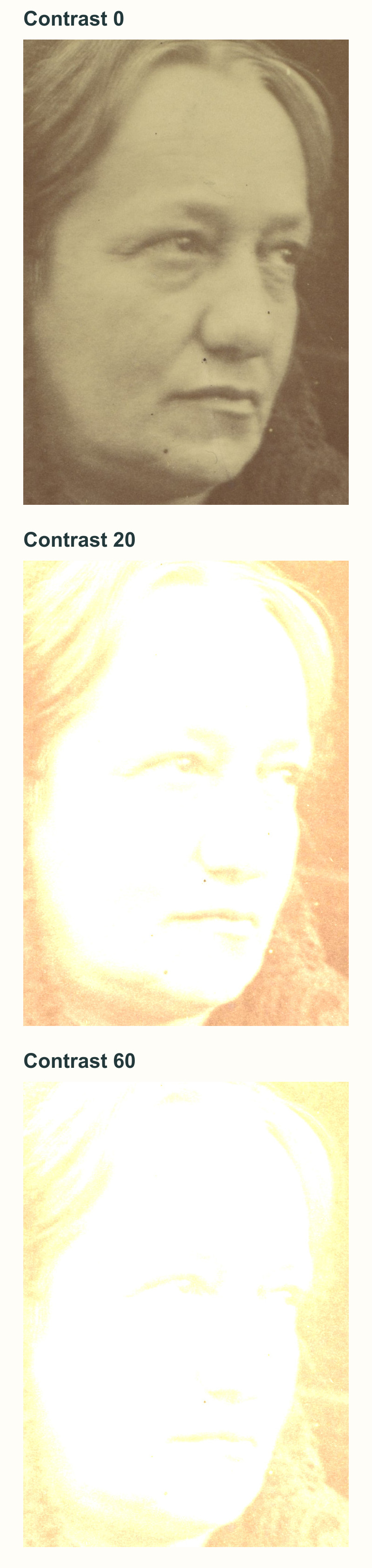
At Contrast 20, much of the forehead and face becomes white, along with broad areas of the clothing. The actual mosaic changes to pale orange, yellow and near-white areas. It looks brighter, but that does not show that the missing facial shading has become more useful.
At Contrast 60, still more of the source becomes white. The mosaic is paler again. We cannot see recovered eyes, nose or mouth detail that would justify choosing this version for the portrait's expression.
The important loss happens in the edited photo itself. Once several different light tones become the same white in that saved bitmap, the later grid cannot distinguish those earlier tones by sampling it. Return to the preserved original when you want to try another adjustment.
Count clipping without turning the count into a score
We checked the applied photo pixels as well as looking at the images. Each source contains 2,400 x 2,400 = 5,760,000 pixels. Here, a pure-white pixel means that all three RGB channels are 255 in the processed image.
| Fabric Editor contrast | Pure-white source pixels | Share of source |
|---|---|---|
| 0 | 0 | 0% |
| 20 | 880,774 | 15.3% |
| 60 | 1,253,605 | 21.8% |
The percentage describes the source photo, rather than a count of white quilt patches. Contrast 60 turns roughly one fifth of this particular source into pure white. None of these three sources contains pure-black RGB pixels.
A white area is not automatically a mistake: a plain white background may be exactly what you want. Here, the new white areas occupy facial and clothing tones we wanted to keep. That location matters more than finding a supposedly ideal percentage.
Adobe's histogram guide explains that clipped highlights can indicate washed-out detail and that there is no single correct histogram shape. If your photo editor offers clipping warnings, use them alongside the picture. The pixel counts above come from our analysis of the exported images; we are not showing a QuiltLab histogram or clipping-warning panel.
Check the used palette after every conversion
The neutral and Contrast 20 mosaics each used eight colors. Contrast 60 used seven, even though the cap stayed at eight. QuiltLab recalculates the palette from each applied image, so the light and dark entries also change between versions.
A smaller used palette can make a design simpler to manage, but it does not settle whether the subject is clearer. In this comparison, seven colors accompany a paler source and fewer distinctions in areas we cared about. We would not choose that result merely because it needs one fewer color.
Keep a note of the source version, control value and actual used-color count together. Our photo-mosaic tutorial covers the broader setup and fabric-planning steps; this comparison isolates source preparation before those later decisions.
Make the comparison without losing your starting point
- Open your saved mosaic and use File > Save a copy. Give the copy a name that identifies the source adjustment. Confirm that you are in the copy before editing.
- Choose Edit Image. Change one adjustment while keeping the crop, rotation and dimensions steady. Check the image position as well; unintended movement would change the comparison.
- Choose Apply to Mosaic, then recheck the patch, field, color-source and cleanup settings. Regenerate the mosaic using the same settings as the neutral version. Choose these settings before making palette edits: changing color source, cleanup or analysis quality clears those edits.
- Compare the applied source with its grid at the same displayed size. Inspect the boundaries you named at the start, then review the whole composition.
- Save and reopen the result. Open every page of its block guide and match the dimensions, grid and color counts to that version.
Our three guides each had two pages. Every guide matched its 576-cell export and complete color counts. We also reopened the original quilt afterward: its source and exported grid were unchanged. The saving guide explains the difference between a pending change and a completed save.
For this portrait, the next useful step is to keep the neutral source and reconsider the interpretation rather than committing to either clipped version. For your photograph, choose one important boundary, adjust a copy, and keep only a result that makes that boundary more useful while preserving the tones you still need.
Free patterns to try
Printable PDF patterns with cutting charts and diagrams, free to download.
Family Photo Quilt
Quilt patternBeginner · 54 x 62 in lap quilt
Cider Mill Geese
Quilt patternBeginner · 44 x 56 in crib or lap
Instant Camera Mini
Quilt patternBeginner · 24 x 24 in mini quilt
Plan your next quilt
Lay out blocks and try colors in QuiltLab's grid editor before you cut.
Free forever, no card needed.
Explore photo quilt designGet quilting tips by email
QuiltLab updates, tips and quilting inspiration. Unsubscribe anytime.
Related posts
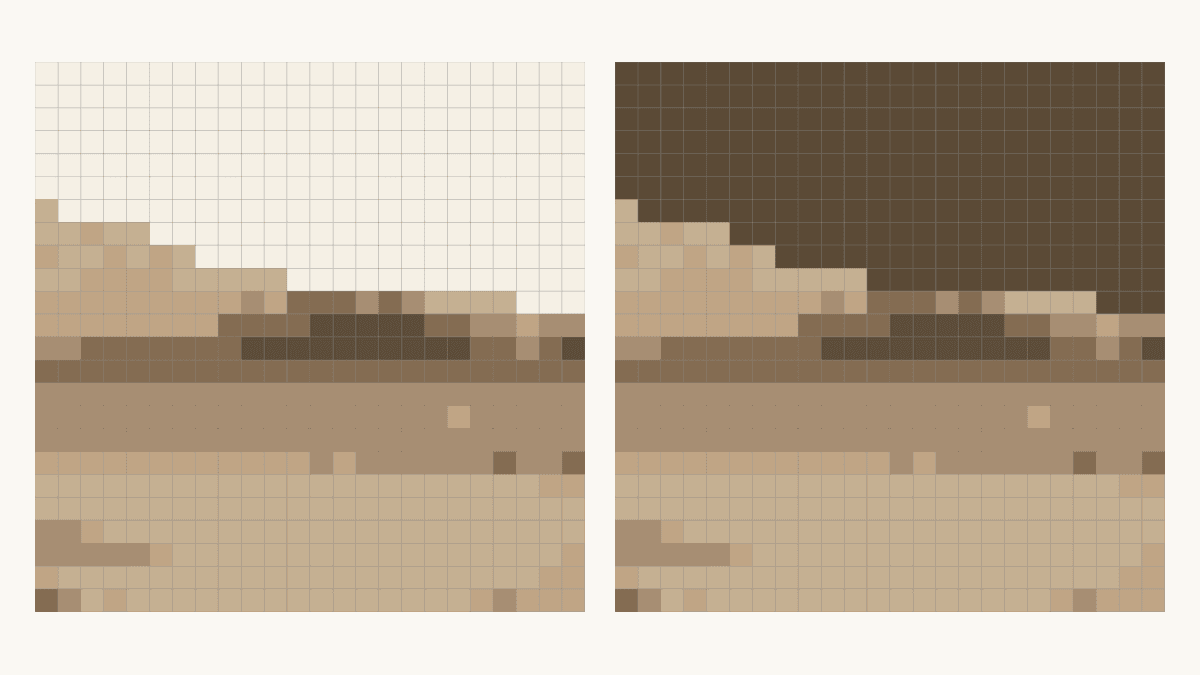
How to Change Photo Quilt Background Contrast
Compare two saved background edits at one fixed grid. Check shared colors, inspect a tree edge and keep the matching PDF guide before choosing cloth.
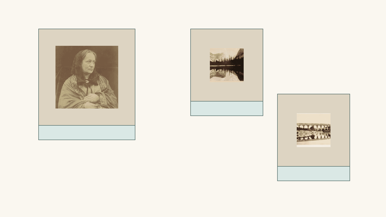
Plan a Printed Photo Memory Quilt Layout
Give one photo room to lead, add separate captions and compare two measured drawings using provider-listed panel sizes.
Keep the Main Shapes in a Landscape Photo Quilt
Compare three landscape crops at 576 patches. See which river and tree shapes remain, and separate a cropped-out summit from a faint reduced outline.