How Many Colors Does Your Photo Quilt Need?
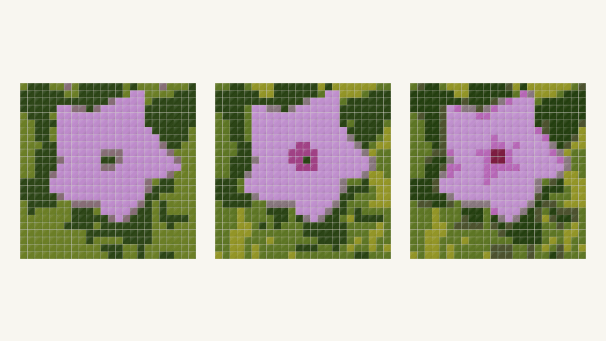
Use the smallest palette that keeps your subject's main shape and focal point clear. Compare the same crop at a few color limits before choosing fabrics. For the flower below, we would keep eight colors for its distinct dark red center; six works if a broader magenta accent is enough.
Our photo quilt color reduction study keeps the grid at 576 patches throughout. Four colors still give a recognizable pink flower, but lack a separate red center. The useful question is what the extra colors contribute, rather than whether the smaller number sounds easier.
Decide which color boundary matters
Look at the photograph before looking at the generated palette. Name the relationship that gives the subject its character: a dark center inside pale petals, a light muzzle against darker fur, or a roof against the sky.
For this flower, we want both the petal outline and the dark red area at its center. We can let the circular water droplets disappear. That gives the comparison a specific job; a pleasing collection of pinks and greens alone would not settle it.
In her portrait-pattern tutorial, Terry Aske recommends editing a copy, checking light-to-dark differences and saving versions while simplifying a photograph. Her method is for appliqued portraits. The transferable habit is comparing the important boundaries as the image becomes simpler.
Keep your source beside each result. Once you know where a feature belongs, it is easy to imagine it in a patch that does not actually describe it.
Hold the grid steady while comparing palettes
On October 24, 2026, we made three QuiltLab studies from the same 768-pixel-square crop of Morning Flower. The photograph is CC0. Its current file page credits Velatrix; the original upload and structured creator record name Nicolas M. Perrault.

Each study has a 24-by-24-inch finished field, one 24-inch block, and 1-inch finished square patches. That gives 24 x 24 = 576 patches. Changing the color limit leaves that number unchanged.
We kept Squares, From the photo, Fidelity and Stretch for all three. Clean up stray patches stayed Off, and Simplify background stayed off. Only Maximum colors changed: four, six and eight. We saved and reopened all three, then checked their exported images and guides.
Our photo-mosaic tutorial covers the starting workflow, and the Quilt Editor guide explains the design modes. This comparison begins after choosing the source crop and grid.
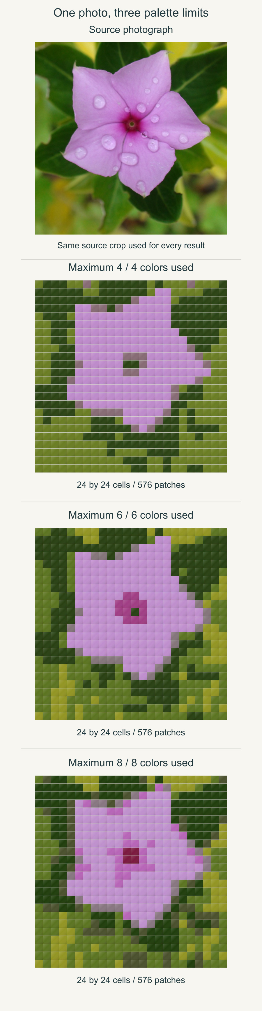
The three results used exactly four, six and eight colors in this experiment. Maximum colors is still a ceiling: always read the actual result rather than assuming that every requested entry appears.
Ask what the additional colors buy you
At four colors, the pink flower separates from the two main greens. Its silhouette is recognizable. The central red surround becomes gray-mauve, with two dark green cells in the middle. The gray-mauve also appears elsewhere, including along the flower's edge.
At six colors, a separate magenta entry occupies twelve patches around the center. That makes the focal area easier to pick out. One dark green cell sits at the source's tiny green eye. It keeps a point of green inside a magenta surround, rather than the photograph's dark red.
At eight colors, a dark red entry occupies four central cells in a two-by-two group. The source's tiny green point disappears. The result also adds pink and foliage distinctions elsewhere. Those extra entries do more than darken the middle: they change how the whole image is divided into color areas.
| Colors used | Center result | A reason to choose it |
|---|---|---|
| Four | Shares dark green with foliage | The broad flower silhouette is enough |
| Six | Twelve magenta patches around one green point | A larger colored center accent is enough |
| Eight | Four dark red center patches | A distinct dark red center matters |
For this source and grid, eight is our choice if the center is the goal. Six is a reasonable simpler interpretation if you like the magenta accent and green point. Four gives up a feature we wanted, even though the flower remains readable.
If your goal requires both the dark red surround and its tiny green point, none of these three previews meets it. Eight keeps the red but loses the green; six keeps a green point inside a magenta surround. Keep that combined goal on your comparison sheet when evaluating a different grid or source crop.
None of these outputs turns the dew drops into reliable round shapes. Adding colors cannot be judged only by the total: inspect the particular detail you hoped to recover.
Compare the same center cells close up
The windows below compare the source with rows 9 through 13 and columns 10 through 15 from the existing outputs. Rows count from the top and columns from the left. Each output window contains 5 x 6 = 30 cells; it is a display crop, rather than a newly generated closer view.
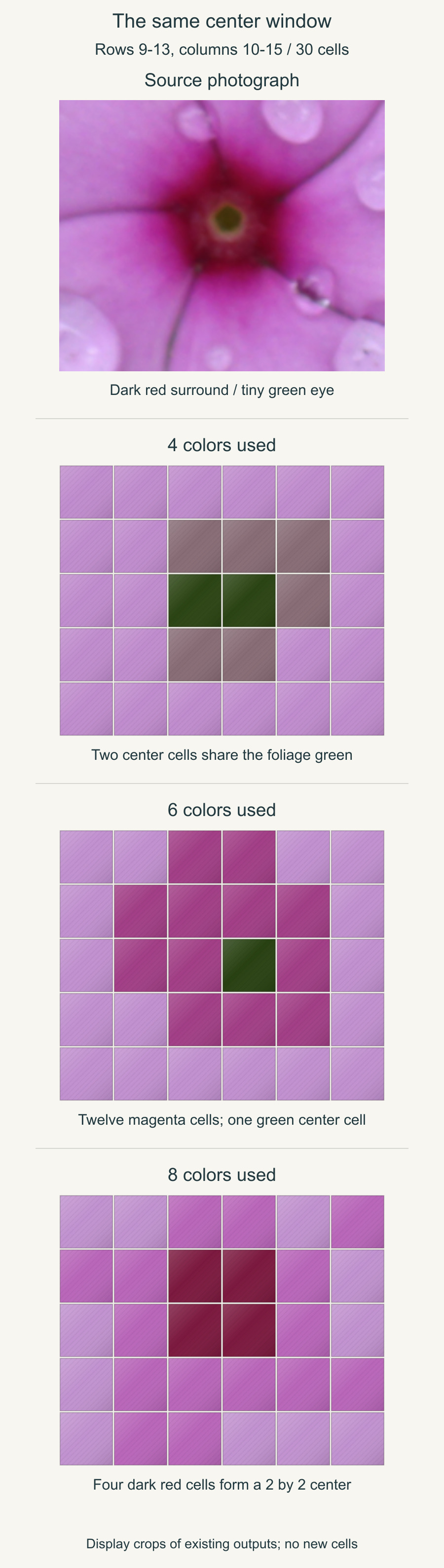
In the eight-color result, the four dark red cells are at rows 10 and 11, columns 12 and 13. At this study's 1-inch finished patch size, they form a 2-by-2-inch finished area. Their 4 square inches occupy 4 / 576, or about 0.69%, of the whole image. The guide rounds their share to 1%.
A small share can carry a large part of the subject's identity. Deciding that an entry is unimportant because it covers less than one percent would remove the very center we chose to preserve.
Leni Levenson Wiener's fabric-collage tutorial makes a related distinction: she uses a simplified pattern to read value regions and continues referring to the original photograph for color choices. Her collage construction differs from these squares, but the source remains the reference for deciding which regions matter.
Expect the palette to be recalculated
A six-color analysis is not necessarily an eight-color result with two entries deleted. QuiltLab recalculates colors and assignments for each analysis. In our three results, even the main pale purple changes slightly.
That matters when you compare two saved previews. Look at the whole picture again instead of tracking only the newly visible darkest chip. A higher limit might improve a focal point while creating distinctions elsewhere that you do not want to manage in fabric.
Also check what another program means by its color setting. The GIMP Posterize manual defines levels per RGB channel. Three levels can allow 3 x 3 x 3 = 27 color combinations; that is not a promise of three fabric colors. Read the actual simplified image and its used-color count before carrying a number between tools.
Keep the chosen result and guide together
All three downloaded QuiltLab guides had two pages. Each recorded 576 patches, and every color count matched the corresponding exported grid. The color key continued onto the second page.
Save the guide for the version you choose, then reopen that saved quilt before moving on. Our saving guide explains the save and recovery states. A familiar-looking flower is not enough to tell two palette versions apart.
If you want fewer patches as well as fewer colors, that is a separate comparison. Our patch-size study changes the grid and crop; keep those choices separate while judging this palette change.
Once the digital relationships work, compare real cloth beside its important neighbors. Our solid-fabric matching guide covers that step. A screen entry gives you a color direction; choose the actual light, dark and accent fabrics together.
Open your chosen photo, name the color boundary you want to keep, and compare a small set of palette limits at one fixed grid. Keep the lowest count that serves that goal, with its matching saved result and guide. Then choose cloth for those relationships before cutting the full design.
Free patterns to try
Printable PDF patterns with cutting charts and diagrams, free to download.
Color Field
Quilt patternBeginner · 36 x 48 in wall quilt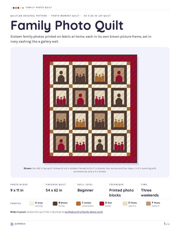
Family Photo Quilt
Quilt patternBeginner · 54 x 62 in lap quilt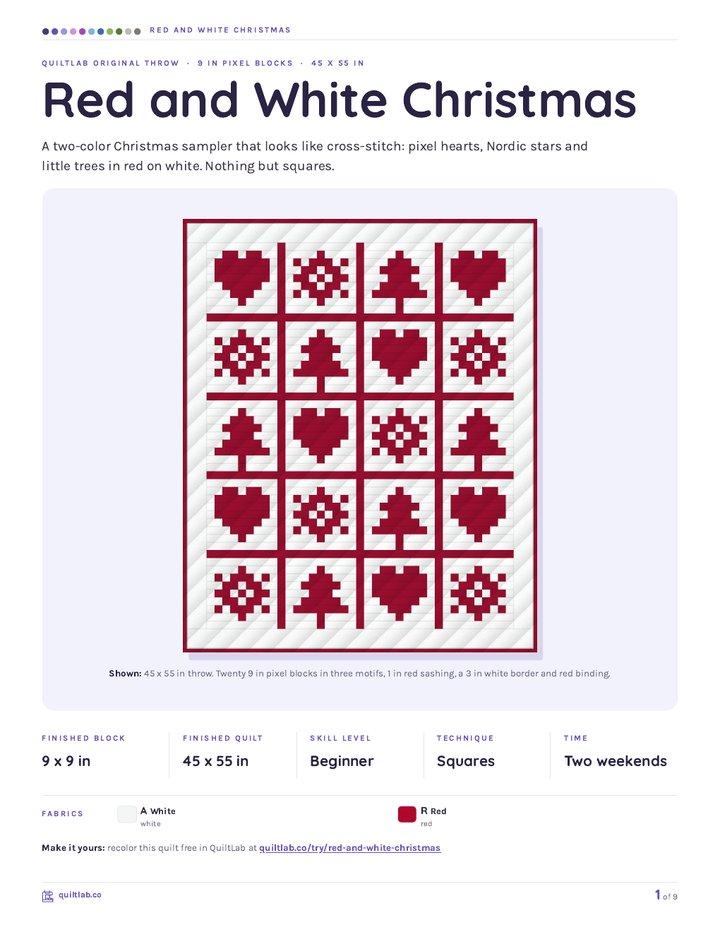
Red and White Christmas
Quilt patternBeginner · 45 x 55 in throw
Plan your next quilt
Lay out blocks and try colors in QuiltLab's grid editor before you cut.
Free forever, no card needed.
Explore photo quilt designGet quilting tips by email
QuiltLab updates, tips and quilting inspiration. Unsubscribe anytime.
Related posts
How to Change Photo Quilt Background Contrast
Compare two saved background edits at one fixed grid. Check shared colors, inspect a tree edge and keep the matching PDF guide before choosing cloth.
Photo Quilt Contrast: Keep Useful Detail
Compare three source-photo adjustments at one quilt grid. See where highlights disappear and check the applied image before choosing a mosaic.
Plan a Printed Photo Memory Quilt Layout
Give one photo room to lead, add separate captions and compare two measured drawings using provider-listed panel sizes.